Design Validation
For Every Pixel.
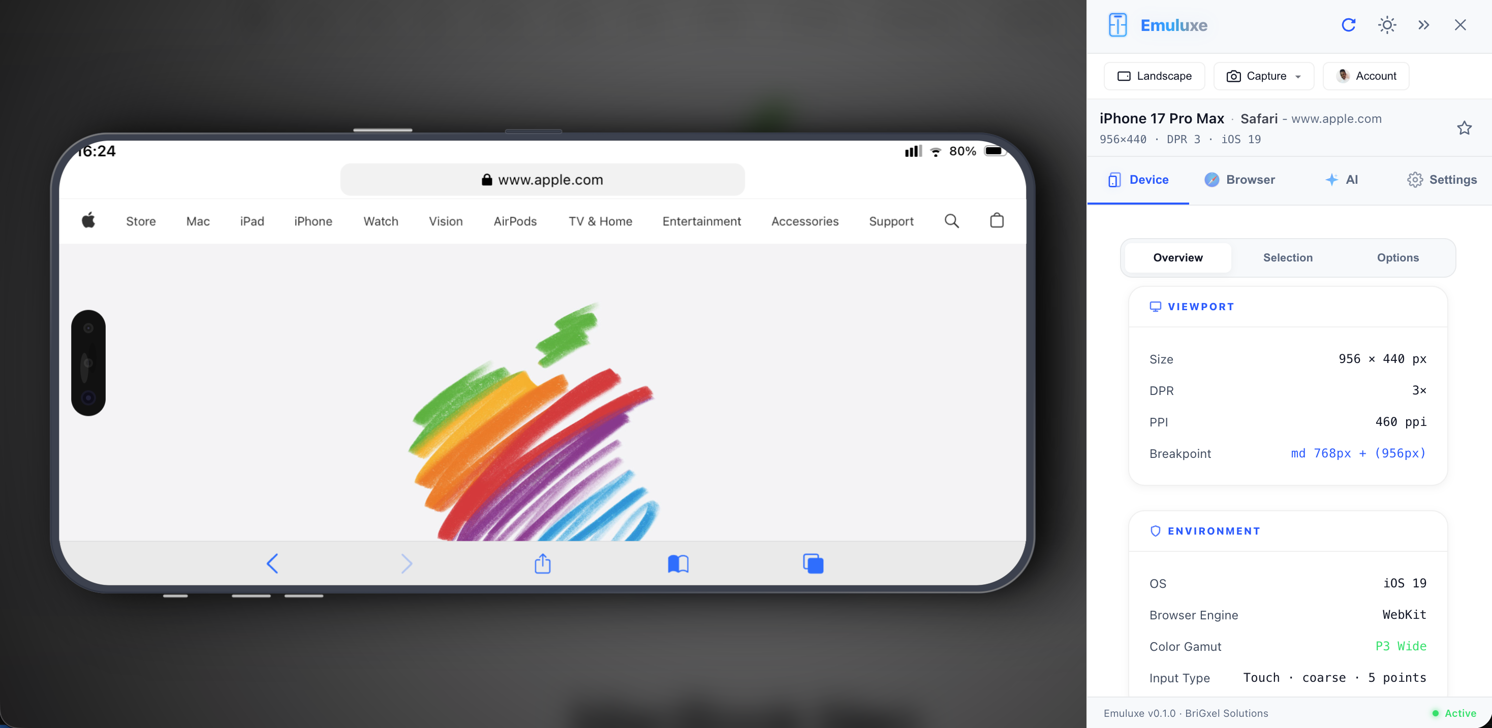
See how designs render across 80+ real device screens (notch geometry, safe areas, DPR). Verify responsive breakpoints, font rendering, and color accuracy instantly.
Safe-Area Auditing
Visualize exact notch geometries and home indicator safe-zones. Ensure your UI never clips on the latest 'dynamic island' models.
Color Fidelity
Test P3 wide-gamut colors and simulate how your designs appear on various mobile display panels (AMOLED, Liquid Retina, etc.)
Typography Preview
Verify font rendering across OS-level engines. Catch subtle weight and kerning differences between iOS WebKit and Android WebView.
Your Vision,
Perfectly Mirrored.
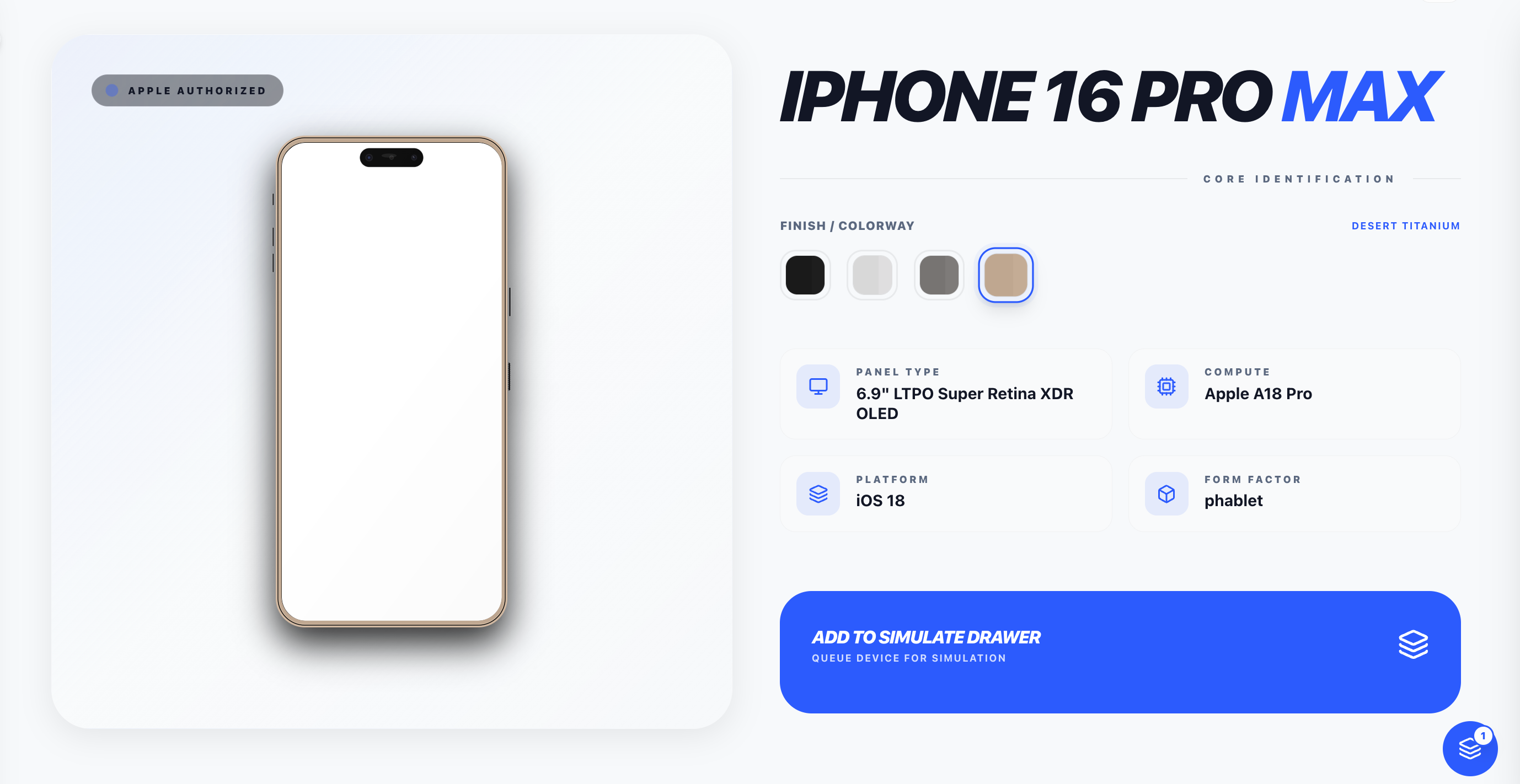
Designing for mobile means designing for context. Emuluxe lets you step inside different hardware profiles to see exactly what your users see.
DPR Awareness
Simulate exact Device Pixel Ratios (2x, 3x, 3.5x) to ensure iconography remains razor-sharp.
Breakpoint Testing
Rapidly switch between dozens of device widths to verify responsive fluid layouts.
Display Calibration
Preview how your brand colors shift on budget displays vs. flagship OLED screens.
Handoff that
Actually Works.
Bridge the gap between Figma and Production. Verify the implementation on the exact hardware you designed for, right as it's being built.