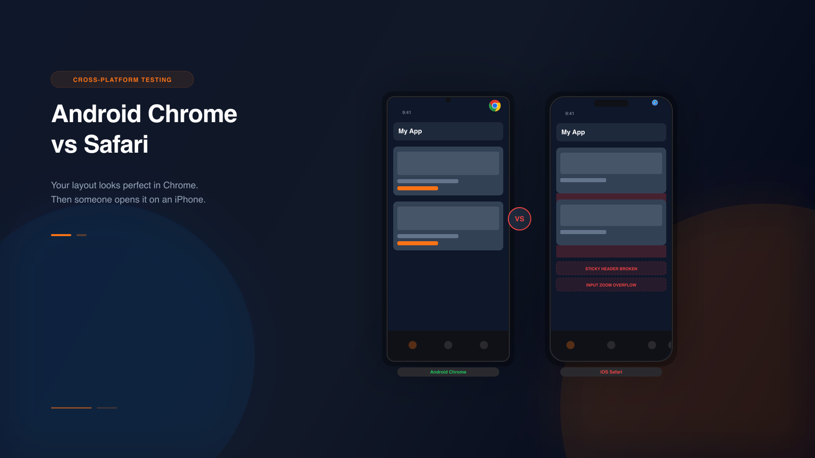
If you develop on a Mac and test in Chrome, you have a blind spot. Chrome is the most popular development browser. It handles CSS in ways that feel intuitive and predictable. But Chrome is not Safari. Safari is what every single user on iPhone is running. And Safari renders the same CSS differently.
There is no way around this. Every iPhone uses Safari's WebKit engine. Every Android phone uses Chrome's Blink engine. These are different rendering engines with different histories, different bugs, and different interpretations of the CSS specification. The result is that the same layout can look different on an iPhone and an Android phone.
These differences do not show up when you resize your desktop browser. They do not show up in Chrome DevTools device mode, because DevTools uses Chrome's own rendering engine regardless of which device you select. They only show up when you test on the actual devices or use simulation that accounts for the real rendering engines. Here are the 12 most common gaps, explained in detail, with the specific ways Emuluxe catches each one.
1. The 100vh problem
This is the most well-known cross-platform rendering difference, and it still breaks layouts every day. On Android Chrome, 100vh means the full height of the viewport, including the area behind the browser toolbar. On iOS Safari, 100vh historically meant the visible area of the viewport, excluding the browser toolbar.
The practical result is that a hero section set to 100vh looks full-screen on Android but leaves a noticeable gap at the bottom on iPhone. This gap is not consistent. It changes depending on whether the Safari toolbar is collapsed or expanded, which depends on how far the user has scrolled.
Apple introduced dvh (dynamic viewport height) and svh (small viewport height) as solutions. But adoption is inconsistent. Many developers still use 100vh because it is the most familiar unit, and because dvh and svh have their own edge cases. The dvh unit changes dynamically as the toolbar appears and disappears, which can cause jarring layout shifts during scroll. The svh unit is more stable but does not fill the full available space when the toolbar is expanded.
Emuluxe renders your page on both an iPhone device profile and an Android device profile side by side. The 100vh gap shows up immediately. You can see exactly how many pixels of dead space your hero section has on iPhone versus Android. The AI Audit Engine flags viewport height mismatches and suggests which units to replace 100vh with, specific to your layout.
2. Flexbox gap inconsistency
The CSS gap property in flexbox has a complicated history. Chrome added support for gap in flexbox in 2020. Safari did not add it until Safari 14.1 in 2021. If your users are on any iPhone running an older version of iOS, or if they are using certain WebView contexts on iOS, gap in flexbox may simply not work. Items that should be spaced apart collapse together.
Even on current versions, the gap property behaves differently across browsers when combined with wrapping. In a flex container with flex-wrap set to wrap, Safari may add extra space between wrapped rows that does not match what Chrome renders. A card grid that looks neatly spaced on Android may have inconsistent gaps on iPhone.
This is especially painful in responsive designs where the flex direction changes. A horizontal row with gap may work fine on both platforms, but when the items wrap to multiple lines at smaller viewports, Safari may distribute the cross-axis gap differently. The result is a layout that looks correct on Android but has misaligned or overcrowded cards on iPhone.
Emuluxe lets you test the same grid on iPhone and Android profiles simultaneously. You toggle between the two with a single click. The difference in flexbox gap rendering is visible immediately. The Layout Inspector in Emuluxe's AI Audit Engine detects uneven spacing in flex containers and identifies whether the root cause is a gap property mismatch.
3. Position sticky failures
Position sticky is one of the most common CSS patterns for mobile navigation, table headers, and sidebar content. It is also the one that fails most silently on iOS Safari.
On Android Chrome, sticky positioning works as expected across most scenarios. On iOS Safari, a sticky element may simply not stick, with no indication that anything is wrong. The most common failure happens when a parent element has overflow set to hidden, auto, or scroll anywhere in the ancestor chain. Safari is stricter about the stacking context requirements for sticky positioning. A grandparent with overflow hidden can break sticky behavior on iPhone while the exact same DOM structure works perfectly on Android.
A second common issue is sticky elements that jump or flicker during scroll on Safari. This is related to how WebKit handles scroll performance and repaint scheduling differently from Blink. The sticky element briefly detaches during fast scroll and reattaches when scrolling stops. On Android, this transition is smooth. On iPhone, it is visible and distracting.
Emuluxe renders live scrolling on both device profiles. When you test a sticky header on an iPhone profile, you can actually scroll the page and see whether the header sticks, jumps, or disappears entirely. The Interaction Analyzer detects sticky positioning failures by comparing the expected behavior of position sticky against the actual rendered position during simulated scroll. It tells you which ancestor overflow declaration is breaking your sticky behavior.
4. Input zoom on focus
When a user taps an input field on iOS Safari, the browser automatically zooms in to make the text larger and more readable. This is helpful for users but destructive for many layouts.
Android Chrome does not zoom on input focus by default, as long as the font size on the input is at least 16 pixels. Safari zooms regardless if the computed font size is below 16 pixels. This means a form that works perfectly on your Android test device zooms in and breaks on iPhone.
The zoom shifts the visual viewport. Content that was visible before the zoom scrolls off screen. Fixed-positioned elements move unpredictably. The user sees a zoomed-in section of their form with no way to zoom out without tapping elsewhere, which often triggers unintended interactions.
The standard fix is to set input font sizes to at least 16 pixels. But this is easy to miss because it works fine on your Android test device. Many developers set form input fonts to 14 pixels for aesthetic reasons and never realize it causes a zoom issue on iPhone until a user reports it.
Emuluxe simulates the input zoom behavior when you interact with form elements on an iPhone device profile. You can tap on an input field and see exactly what the user sees, including the zoom level and any layout breaking that follows. The Accessibility Analyzer checks input font sizes across all device profiles and warns you when font sizes fall below the 16-pixel threshold that triggers Safari input zoom.
5. Scrollbar behavior differences
Android Chrome shows scrollbars only when the user is actively scrolling and hides them when scrolling stops. iOS Safari does not show scrollbars at all by default. There is no visual indication that more content exists below the fold on iPhone unless the user scrolls.
This matters more than it seems. If your page has a carousel, a horizontal scroll list, or a container with overflow scroll, Android users see a scrollbar and understand that additional items exist. iPhone users have no scrollbar to guide them. They may never discover that the carousel has more items to the right, or that the card section scrolls horizontally at all.
The difference is especially impactful for ecommerce product rows, image galleries, and onboarding flows where horizontal scrolling is the primary navigation pattern. If the user does not know more content exists, they cannot engage with it.
Emuluxe renders both platforms with their native scrollbar behavior. When you scroll a product row on the Android profile, you see the scrollbar appear and fade. When you do the same on the iPhone profile, you see no scrollbar. The Interaction Analyzer detects containers with overflow scroll and checks whether the content inside exceeds the container bounds on each platform. It warns you when content exists that a user may never discover.
6. Safe area handling
Both platforms handle safe areas differently, and the differences are more nuanced than most developers realize. iOS Safari respects the safe-area-inset CSS environment variables and adjusts the layout to avoid notches, dynamic islands, and the home indicator. Android Chrome handles safe areas through its own system, and the behavior varies significantly across manufacturer skins.
Samsung One UI, Xiaomi MIUI, Google Pixel Experience, and other Android skins each have their own safe area handling. A bottom navigation bar that respects the home indicator on iPhone may overlap with the Android navigation pill or gesture bar. A floating CTA that sits above the home indicator on iPhone may sit directly on top of the Android system navigation bar on a Samsung device running One UI.
The safe-area-inset variables themselves behave differently. On iPhone, these variables return pixel values that account for notches and the home indicator. On Android, they may return zero even on notched devices, or they may return values that do not account for manufacturer-specific UI elements.
Emuluxe includes accurate safe area definitions for every device profile, including manufacturer-specific safe area variations for Samsung, Google Pixel, Xiaomi, and other Android devices. When you test your bottom navigation bar on an iPhone 15 Pro and a Galaxy S25 Ultra side by side, you see exactly where the safe area falls on each device. The Layout Inspector detects content that renders inside safe area zones and flags potential hardware overlap issues.
7. Touch event timing
The delay between a user touching an element and the click event firing differs between platforms. iOS Safari adds approximately a 300-millisecond delay on tap events. This delay exists so Safari can distinguish between a single tap and a double-tap zoom gesture. Android Chrome eliminated this delay years ago when the viewport meta tag is set to device-width with a scale of 1.
The result is that interactive elements feel slightly sluggish on iPhone compared to Android. A menu toggle that feels instant on Android has a perceptible delay on iPhone. A button that fires on press on Android fires on release on iPhone. This difference affects any custom click handler that depends on fast user feedback, including navigation toggles, expand and collapse interactions, and any UI element where the user expects immediate feedback.
The delay also affects drag and swipe interactions. On Android, touch events fire immediately and continuously during a drag. On iOS, there is a slight initial delay before the drag events begin, which can make swipe actions feel unresponsive or sticky.
Emuluxe provides accurate touch event timing for both platforms. The Interaction Analyzer measures click-to-response latency on each device profile and flags interactions where the delay exceeds acceptable thresholds. This is especially useful for validating custom gesture handlers, drag-and-drop interfaces, and any interaction where timing affects the user experience.
8. Overflow scrolling momentum
iOS Safari has elastic overscroll, also known as rubber-banding. When you reach the end of a scrollable area, the content bounces. Android Chrome has a similar overscroll effect, but the visual behavior and the scrolling momentum differ.
More importantly, the CSS property that controls smooth scrolling, webkit-overflow-scrolling, behaves differently. Safari on older iOS versions requires this property set to touch for smooth momentum scrolling. Without it, scrolling feels stiff and mechanical rather than natural. While newer iOS versions handle this better by default, the scrolling feel is still noticeably different between the two platforms, especially on pages with long content sections.
The momentum difference is particularly noticeable in chat interfaces where the user expects to scroll through message history smoothly, or in infinite scroll feeds where the next page loads based on scroll position. On Android, the momentum carries the user further into the content. On iPhone, the scrolling stops sooner, which can affect whether the infinite scroll trigger fires.
Emuluxe simulates the native scrolling behavior for each platform. When you scroll through a message thread on the iPhone profile, you feel WebKit's scrolling physics. On the Android profile, you feel Blink's. The difference is immediate and visceral. The Performance Analyzer tracks scroll momentum and detects whether infinite scroll triggers fire consistently across both platforms.
9. Virtual keyboard behavior
When a user taps an input field on mobile, the virtual keyboard appears and the viewport changes. The way this happens is completely different between Android Chrome and iOS Safari.
On Android Chrome, the keyboard generally resizes the viewport and the layout adjusts accordingly. Fixed-positioned elements like headers and footers typically stay in place while the content area shrinks. The page layout remains stable.
On iOS Safari, the keyboard behavior depends on the input type and the page structure. Fixed-positioned elements may shift upward when the keyboard opens, pushing content out of view. The visual viewport changes but the layout viewport may not, causing a mismatch between where elements are rendered and where they appear to be. The keyboard may cover the active input field entirely, especially on smaller iPhone models like the iPhone SE.
This is critical for chat interfaces, search bars, login forms, checkout flows, and any page where the user needs to see both the input field and the surrounding content while typing. If the keyboard covers the input field, the user cannot see what they are typing. If the layout shifts unpredictably, the user loses context.
Emuluxe simulates keyboard behavior accurately for both platforms. You can tap on an input field in an iPhone profile and see the keyboard appear with the correct dimensions and viewport adjustment. The Layout Inspector detects when the keyboard overlaps input fields or when the layout shifts unpredictably due to keyboard appearance. The AI Audit Engine flags the specific element causing the overlap and suggests viewport-height adjustments.
10. CSS Grid subgrid support
CSS Grid subgrid allows child grid items to inherit their parent's grid tracks, aligning content across nested levels without duplicating track definitions. Chrome has supported subgrid consistently and reliably for years. Safari's subgrid implementation has been slower, more buggy, and has specific edge cases where alignment does not match Chrome.
The most common failure is with min-content and max-content track sizing. When a nested grid uses subgrid to align with a parent grid that has tracks sized with min-content or max-content, Safari may compute the track sizes differently from Chrome. Items that align perfectly on Android may have misaligned rows or columns on iPhone.
Subgrid is especially useful for form layouts, card grids with aligned headers and footers, and any design where visual alignment across nested components matters. The failure mode is subtle. The layout looks correct on Android but items that should line up are slightly misaligned on iPhone. The difference is usually small, a few pixels, but it is visually noticeable.
Emuluxe renders the same grid on iPhone and Android profiles side by side. The Layout Inspector performs pixel-level comparison of grid track alignment across platforms. When subgrid alignment differs between the two engines, the AI Audit Engine flags the specific grid tracks that are misaligned and the computed track sizes on each platform.
11. Font rendering differences
Text rendering is subtly different between iOS Safari and Android Chrome. iOS uses a different font smoothing and anti-aliasing algorithm than Android. The same font at the same size can look noticeably thicker on one platform and thinner on the other, even with identical CSS.
This difference affects line breaks. A line of text that fits on one line on Android may wrap to two lines on iPhone because the rendered text is slightly wider. If your layout depends on precise text measurements, like a button whose width exactly fits its label, or a navigation item where the text must not wrap, the font rendering differences can cause overflow or unexpected line breaks.
The difference is most noticeable with custom fonts loaded via font-face. Web fonts are rendered by the operating system's text engine, which is Core Text on iOS and FreeType on Android. The hinting, kerning, and subpixel rendering are all slightly different. A heading that aligns perfectly with its container on Android may be one pixel off on iPhone, which in a tightly spaced design is enough to look wrong.
Emuluxe renders text using the actual font rendering engine for each platform profile. When you view the same heading on an iPhone 15 Pro profile and a Pixel 9 Pro profile side by side, you see the actual text rendering differences. The Layout Inspector measures text widths on both platforms and flags elements where the width difference exceeds one pixel, identifying potential line-break or overflow issues.
12. Image format and rendering
iOS Safari and Android Chrome handle image formats and rendering differently. While both browsers support modern formats like WebP and AVIF, the decoding quality and compression handling can differ.
More importantly, Safari's handling of object-fit and object-position on images within containers has historically had subtle differences from Chrome. If your image cropping uses object-fit cover or object-fit contain, the exact crop position may differ by a few pixels between platforms. If your layout uses object-position to control which part of the image is visible, the positioning may shift slightly between iOS and Android.
This difference also applies to background images. The background-size cover property may scale images slightly differently on the two platforms, especially when the container aspect ratio does not match the image aspect ratio.
The difference is small: usually a few pixels. But in a hero image where the subject's face is the focal point, a two-pixel shift can move the crop line through the subject's eyes. In an ecommerce product image, a slight crop difference can cut off part of the product.
Emuluxe renders images on both platform profiles with the actual browser rendering behavior. The Layout Inspector compares image crop positions between iPhone and Android and flags images where the visible crop differs by more than two pixels. This catches the subtle image rendering differences that a quick visual check would miss.
How to catch these differences
The only reliable way to catch cross-platform rendering differences is to test on both platforms. Desktop browser resizing does not reveal these issues because desktop Chrome and desktop Safari are completely different browsers from their mobile counterparts. Desktop Chrome runs the Blink engine on a desktop operating system. iOS Safari runs the WebKit engine on iOS. They share a name but not behavior.
Chrome DevTools device mode simulates viewport dimensions. It does not simulate the Safari rendering engine. It does not simulate WebKit's CSS behavior. It does not simulate iOS's font rendering, scrolling physics, touch event handling, or keyboard behavior. Selecting an iPhone in DevTools gives you Chrome's rendering engine at iPhone dimensions. It will never show you the 100vh gap on Safari. It will never show you the sticky positioning failure. It will never show you the input zoom issue.
You need either real devices running both platforms, or simulation that accounts for the actual rendering engine differences on each platform.
How Emuluxe solves cross-platform testing
Emuluxe provides high-fidelity mobile simulation with accurate rendering for both iOS Safari and Android Chrome. You can run the same page on an iPhone 15 Pro profile and a Galaxy S25 Ultra profile side by side, directly in your editor, without switching tools or deploying to staging.
The simulation handles the differences that DevTools cannot. Emuluxe renders with the actual viewport dimensions, safe area insets, pixel density, user agent string, touch events, scrolling physics, keyboard behavior, font rendering, and browser chrome for each device profile. When you test on an iPhone profile, you see what an iPhone user sees. When you test on an Android profile, you see what an Android user sees.
The AI Audit Engine in Emuluxe runs four analyzers simultaneously on every simulation session. The Layout Inspector catches overflow, clipping, spacing gaps, grid misalignment, and text rendering differences across eight layout detectors. The Performance Analyzer flags layout shifts and scroll performance issues that differ between platforms. The Accessibility Analyzer detects safe area violations, input zoom issues, and touch target sizing problems across seven WCAG checks. The Interaction Analyzer identifies sticky positioning failures, touch event timing gaps, and keyboard overlap issues that break user interaction.
Each analyzer returns severity ratings and code-snippet fixes with specific selectors. When Emuluxe detects a 100vh gap on your iPhone profile that does not exist on your Android profile, it tells you which element is affected, shows you the gap size in pixels, and suggests the exact dvh or svh replacement for your use case. When it detects a sticky header that works on Android but fails on iPhone, it identifies the ancestor element with overflow hidden that is breaking the sticky context.
The workflow takes seconds. Start your dev server. Launch Emuluxe in VS Code or Cursor with Cmd+Alt+E. Select your iPhone device profile from the Foundry. Select your Android device profile. The simulator shows both side by side. Toggle between them. Scroll, tap, and interact. The differences show up immediately. The AI Audit Engine provides the fixes.
For teams using CI/CD, Emuluxe's CLI supports automated cross-platform testing. Run side-by-side screenshots of your critical pages on iPhone and Android with a single command. The snapshot output posts directly to your pull request, giving your team visual proof that the page renders correctly on both platforms before merging.
For AI-assisted development workflows, Emuluxe's MCP server gives AI coding agents direct access to device context across both platforms. Your coding assistant in Cursor or Claude Code can request a side-by-side simulation, receive the rendered viewport data for iPhone and Android, detect the rendering differences, and suggest fixes based on the actual device dimensions and engine behavior.
Make cross-platform testing part of your workflow
Cross-platform testing should not happen only at the end of a project. It should happen during development, before staging, and before production sign-off. Every layout change should be checked on both platforms.
The most effective approach is to add cross-platform checks to your existing workflow. When you implement a new section, check it on iPhone and Android before committing. When you change a grid layout, verify the alignment on both platforms. When you fix a bug on one platform, make sure the fix does not introduce a new issue on the other.
This sounds like extra work, but with Emuluxe it fits inside your existing development flow. You are already checking your work in the browser. Adding an iPhone check alongside your Android check takes an extra 10 seconds. The cost of catching a rendering difference during development is near zero. The cost of catching it after launch, when users are reporting bugs and your team is scrambling to fix them, is orders of magnitude higher.
This also means that if you test on iPhone first and your app works fine there, an Android user might still find it broken. And vice versa. If you fix an issue for Android without checking iPhone, you may introduce a new issue there. Testing both platforms in sequence is the only way to ensure consistency.
Why this matters for every project
Every project that targets mobile users is a cross-platform project, regardless of what framework you use, what device you develop on, or what browser you personally prefer. iOS holds roughly 55 percent of the US mobile market. Android holds roughly 44 percent. If you are not testing on both, you are effectively ignoring nearly half of your users.
The 12 rendering differences listed above are not edge cases. They are the norm. Every responsive layout that touches viewport units, flexbox, sticky positioning, form inputs, scrollable containers, safe areas, touch events, grid, fonts, or images will behave differently on the two platforms in at least one of these areas. The question is not whether your project has cross-platform rendering issues. The question is whether you catch them during development or after launch.
Test on both platforms. Catch the differences early. Fix them before they become support tickets.
