Somewhere there is a phone that makes your site look bad, and you have never seen it.
Your hero image is razor sharp on your 27-inch monitor. On an iPhone it looks soft, almost out of focus. Your 1px borders look clean on a Pixel. On a Galaxy they look twice as heavy. Your carefully tuned layout that fits perfectly at 390px wide suddenly has a horizontal scroll on the same screen size, but only when you open it on a specific phone.
None of these issues are bugs in your code. They are all caused by one hardware property that almost nobody tests: device pixel ratio.
Device pixel ratio, or DPR for short, is the single most ignored variable in mobile web development. It explains why the exact same page renders differently across devices that share the same viewport width. It is also the variable that Chrome DevTools, desktop browsers, and most emulators are structurally incapable of simulating correctly.
This post covers what DPR actually is, the three concrete ways it breaks real sites, why your current testing tools cannot see it, and how Emuluxe lets you test at any pixel density in a few seconds.
What Device Pixel Ratio Actually Is
A phone screen is measured in two completely different kinds of pixels. The screen itself has physical pixels, the tiny dots of light that make up the display. A 6.1-inch iPhone 15 Pro has 1179 physical pixels across its width. But when your CSS says width: 393px, the browser does not use 1179 of anything. It uses a CSS pixel, a logical unit that the browser defines for you.
The relationship between these two is the device pixel ratio.
physical pixels = CSS pixels x devicePixelRatio
An iPhone 15 Pro is a 3x device. Its 393 CSS pixels wide viewport maps to 393 x 3, or 1179 physical pixels. A Pixel 8 is a 2.625x device. Its 412 CSS pixels wide viewport maps to roughly 1080 physical pixels. An older budget Android might be a 1.5x or 2x device.
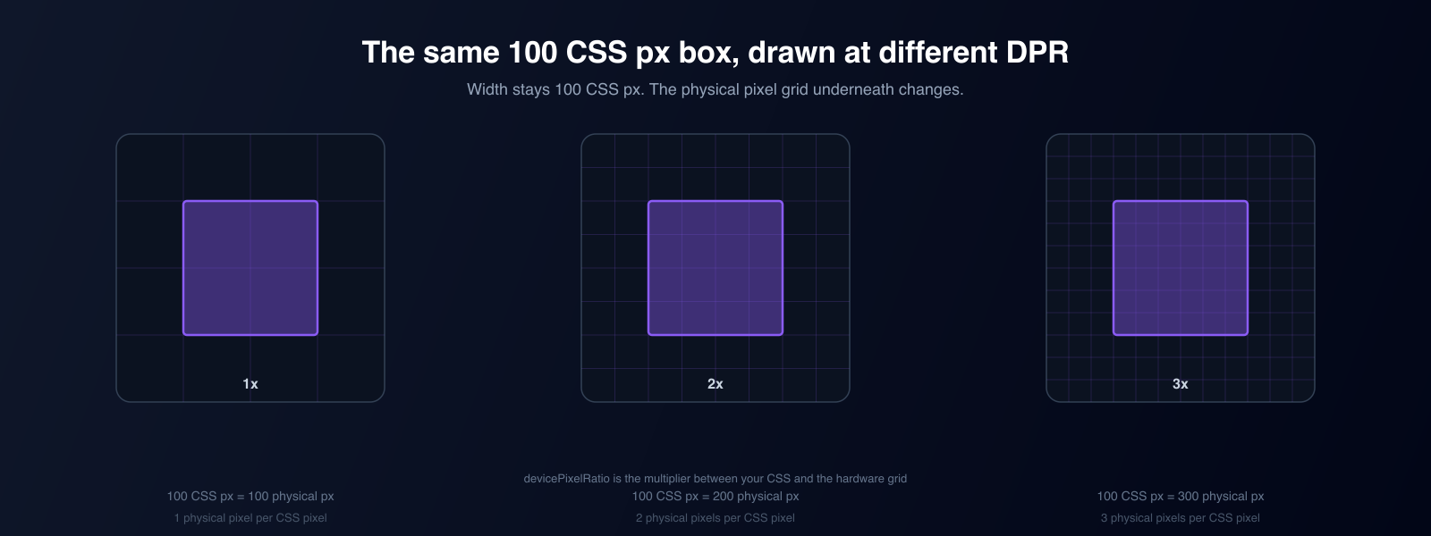
The important part is that DPR has nothing to do with the width of your viewport. Two phones can both be 390 CSS pixels wide and still have completely different pixel densities. Width determines which layout rules apply. DPR determines how that layout is physically drawn. If you only test viewport width, you are testing half the problem.
Real devices and their DPR
| Device | CSS viewport (width x height) | DPR | Physical resolution |
|---|---|---|---|
| iPhone 15 Pro | 393 x 852 | 3.0x | 1179 x 2556 |
| iPhone SE (3rd gen) | 375 x 667 | 2.0x | 750 x 1334 |
| Galaxy S24 | 360 x 780 | 3.0x | 1080 x 2340 |
| Galaxy S24 Ultra | 412 x 892 | 3.5x | 1440 x 3120 |
| Google Pixel 8 | 412 x 915 | 2.625x | 1080 x 2400 |
| Google Pixel 8 Pro | 384 x 854 | 3.5x | 1344 x 2992 |
| Budget Android (720p) | 360 x 800 | ~2.0x | 720 x 1600 |
| iPad 10th generation | 820 x 1180 | 2.0x | 1640 x 2360 |
Notice what this means for testing. If you test only on a desktop monitor at DPR 1, and then check one premium phone at DPR 3, you are covering two points on a spectrum that also includes 1.5x, 2x, 2.625x, and 3.5x. A site can be perfect at 1x and 3x while being visibly broken at every density in between.
Three Ways DPR Silently Breaks Your Site
DPR does not corrupt layouts randomly. It breaks them in a small set of highly predictable ways. If you know these three failure modes, you know exactly what to look for.
1. Blurry images and the srcset trap
This is the most common DPR failure, and it is everywhere.
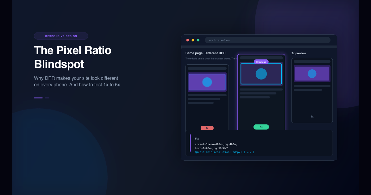
When the browser draws an image, it takes a finite number of physical pixels from the image file and stretches them across the image's CSS size. An image displayed at 800 CSS pixels wide on a 3x iPhone needs 2400 physical pixels of image data to look sharp. If the file is only 800 pixels wide, the browser has to invent the missing 1600 pixels, and the result is the soft, slightly smeared look that you can recognize instantly.
The fix is srcset, which lets you offer multiple image files and lets the browser pick the right one for the current DPR and layout size:
<img
  src="hero-800w.jpg"
  srcset="hero-400w.jpg 400w, hero-800w.jpg 800w, hero-1600w.jpg 1600w"
  sizes="(min-width: 768px) 80vw, 100vw"
  alt="Product hero"
/>
Why an 800px wide image is not enough on a phone
Your desktop monitor at DPR 1 draws the 800px image at 800 physical pixels. It looks perfect. A phone showing the same image at 393 CSS pixels with a 3x DPR needs up to 1179 physical pixels just to fill that column. If the only file available is 800px wide, the browser upscales it by about 50 percent. The upscale is hidden by the phone's small physical size, but the loss of crispness is visible on any text, logos, or product photography. Offering a 1600w and a 2400w file in srcset gives the browser what it actually needs.
2. Borders, shadows, and sub-pixel snapping
CSS pixels are logical units, but the screen can only paint whole physical pixels. When your CSS asks for a 1px border on a 1.5x or 2.625x device, the browser must decide how to map that single logical pixel onto 1.5 or 2.625 physical pixels. It rounds. That rounding is where the weirdness comes from.
On some devices a 1px border renders fine on three sides and noticeably thicker on the fourth. On others a 1px box-shadow appears to flicker or vibrate as the page scrolls. In a grid of equal cards, the dividing lines between them can render at slightly different widths, which reads as broken alignment even though the CSS is identical.
A common mitigation is a fractional border on high-density displays:
.card {
  border: 1px solid #d0d0d0;
}

@media (min-resolution: 1.5dppx) {
  .card {
    border-width: 0.5px;
  }
}
But fractional borders behave differently on every density, which is exactly why this is so hard to get right by reasoning alone. You need to actually see the page at 1.5x, 2x, and 2.625x.
3. dppx media queries that never fire
Some designs branch on pixel density on purpose. High-density devices get retina assets, custom background images, or entirely different layouts:
@media (min-resolution: 2dppx) {
  .logo {
    background-image: url("/logo@2x.png");
  }
}

/* Legacy WebKit syntax, still used in the wild */
@media (-webkit-min-device-pixel-ratio: 2) {
  .app-icon {
    background-image: url("/icon@2x.png");
  }
}
These queries only fire when the browser actually reports a density of 2 or higher. On your DPR 1 desktop, they never run, so the code path is completely untested. The first time it executes is on a real user's phone, and if you wrote it wrong, you only find out from a bug report.
Quick check: can your tooling run these queries?
- Chrome DevTools device mode: yes, but only at the DPR value you manually pick, and the pixels it draws are still scaled by your monitor.
- Android Emulator: yes, it is a real DPR environment, but booting and iterating is slow.
- Xcode Simulator: iOS only, and Mac only.
- A desktop browser: no. It runs at the monitor DPR, period.
Why DevTools and Emulators Cannot See It
You might be thinking: DevTools has a DPR dropdown. Select an iPhone and you get DPR 3, right? Sort of, and this is the subtle part.
Chrome DevTools device mode emulates the reported DPR value. window.devicePixelRatio returns 3 inside the emulated page, and density queries evaluate correctly. But the rendering does not actually happen at three physical pixels per CSS pixel. DevTools scales a logical rendering up to fit your monitor, then your monitor scales it again to its own physical pixels. The reported number is simulated, but the physical pixel grid you are looking at is still your monitor's grid, at your monitor's DPR.
The one-line summary: DevTools device mode changes what the page is told about the screen, not the physical grid the page is drawn on. Real sub-pixel rendering, true image upscaling, and genuine border snapping only happen on hardware with that density.
Real device clouds like BrowserStack do give you true pixel grids, because they are real hardware. But they sit outside your editor, cost per minute, and break the rapid iteration loop. You do not want to wait for a cloud session every time you tweak a border.
| What you are testing with | True physical pixels? | DPR control | Works inside the editor? |
|---|---|---|---|
| Desktop browser | No, runs at monitor DPR | No | No |
| Chrome DevTools device mode | No, scales a logical render | Partial, simulated only | No |
| Android Emulator | Yes | Yes | No |
| Xcode Simulator | Yes | iOS only | No |
| Real device cloud | Yes | Yes | No |
| Emuluxe custom simulation | Yes, retina-accurate DPR engine | Yes, 1x to 5x | Yes |
How to Test at Real Pixel Densities with Emuluxe
Emuluxe is built on a rendering engine that does DPR the hard way. Instead of faking the reported value, it renders the page in an iframe sized to the device's physical pixels and scales it back down to CSS pixels with a scale(1 / DPR) transform. Inside that frame, devicePixelRatio, image scaling, sub-pixel rounding, and media queries all behave as if you were holding the phone. You can test any density without leaving your browser or your editor.
Here is the workflow for a DPR check.
Step 1: Open Custom Responsive Mode
In the Emuluxe Chrome extension panel, switch to a custom viewport instead of a preset device. Custom Responsive Mode is built for exactly this: it lets you type in any width, height, and pixel density instead of being limited to a device catalog.
Step 2: Set the width, height, and DPR
Enter the viewport width and height in CSS pixels, then set the DPR field to Manual and type the density you want to test. The value range goes from 1x to 5x, which covers everything from a budget Android at 1.5x to a Galaxy S24 Ultra at 3.5x. You can leave the frame shell set to Device for context, or switch it to None to get a clean, frameless viewport with no bezel in the way.
When you hit Apply Changes, the panel header updates to show exactly what is being simulated, for example 393 x 852 - DPR 3. The Overview tab reports the live viewport size, DPR, PPI, and the breakpoint that the current width falls into, so you can confirm the simulation before you judge the layout.
Step 3: Compare 1x, 2x, and 3x side by side
DPR bugs only reveal themselves by comparison. Test the same page at 1x and 3x, then at 1.5x and 2.625x. You are looking for three things:
- Do images stay sharp as you step up density?
- Do borders and shadows stay consistent, or do they snap and change weight?
- Does the horizontal overflow or spacing issue appear at one density and not another?
Pro tip: switch DPR without switching context
Keep the width fixed and only change the DPR. Two phones can share a viewport width and still look different. When the layout is identical but the rendering changes, you have isolated a DPR problem rather than a responsive problem. That distinction tells you which fix to write: an asset fix for images, a CSS fix for borders, or a media query fix for density branches.
Step 4: Fix the code and watch it re-render
In the VS Code extension, Live Editing re-renders the simulation whenever you save a source file. Change the srcset sizes, adjust the fractional border, update the dppx query, save, and the simulated phone updates immediately, debounced and ignoring node_modules, .git, and build directories. The feedback loop becomes: change code, save, see it at DPR 3, repeat. No upload, no cloud session, no switching windows.
A Quick Reference for Common Devices
Use this table as a starting point for manual DPR checks. The three values you are most likely to forget are the fractional ones, because they are the ones your monitor can never show you.
| Density | Representative device | What usually breaks here |
|---|---|---|
| 1.0x | Desktop monitor | Nothing. This is the baseline everyone tests. |
| 1.5x | Older or budget Android phones | Sub-pixel border snapping, unexpected fractional pixel widths |
| 2.0x | iPhone SE, iPads, mid-range Androids | Border weight inconsistencies, assets that were never shipped at 2x |
| 2.625x | Pixel 8 family | Layouts that snap at a density you forgot existed |
| 3.0x | iPhone Pro, Galaxy S24, Pixel 9 | Blurry images if srcset stops at 2x |
| 3.5x | Galaxy S24 Ultra, Pixel 8 Pro | The same blurry-image problem, one step worse |
Interactive Checklist: Is Your Site DPR-Ready?
Run this checklist against any page you are about to ship. Each item takes a minute with Emuluxe and catches a class of bugs that desktop testing can never surface.
- Test the page at DPR 1, 2, and 3 with the same viewport width and confirm images stay sharp
- Check that product, avatar, and background images ship a 2x and a 3x variant in
srcset - Look for borders and box-shadows that change weight or flicker between densities
- Confirm
-webkit-min-device-pixel-ratioandmin-resolutionqueries run at their target density - Test one fractional density such as 1.5x or 2.625x, not just the round numbers
- Verify no horizontal scroll appears at 1.5x when the layout was tuned at 3x
- Watch the Overview panel's reported PPI and breakpoint match your expectation for each test
If you checked every box, your site survives the pixel ratio spectrum. If any box is unticked, you now know exactly which density to open first.
Start Testing at the Right Pixel Density
Device pixel ratio is the blindspot that sits between "it works on my screen" and "it works on every phone." It is invisible in desktop DevTools, annoying to reach in emulators, and expensive to hit repeatedly in a real device cloud. But it is fully addressable when your simulation tool actually renders at the density you ask for.
Emuluxe's Custom Responsive Mode gives you arbitrary width, height, and DPR control from 1x to 5x, with a retina-accurate rendering engine behind it. Live Editing in the VS Code extension turns DPR fixes into a save-and-see loop inside your existing workflow.
Install the Chrome extension, open your site, set the DPR to 1.5x, and look at your hero image. You will understand the blindspot immediately.