
Apple's first foldable iPhone is expected to launch in late 2026. Ming-Chi Kuo's supply chain analysis confirms that Samsung Display has been contracted to supply the foldable panels, with 7-8 million units ordered to meet cumulative demand over a 2-3 year lifecycle. Foxconn is set to begin assembly in Q3 or early Q4 2025, with mass production commencing in the second half of 2026.
The device will feature a liquidmetal hinge — an amorphous alloy 2.5x stronger than titanium, resistant to bending, deformation, and pressure. Samsung Display's panel integrates the touch layer directly into the display, reducing overall thickness by 19% while improving color reproduction and peak brightness. The hinge design aims to reduce or eliminate the display crease that has plagued competing foldables.
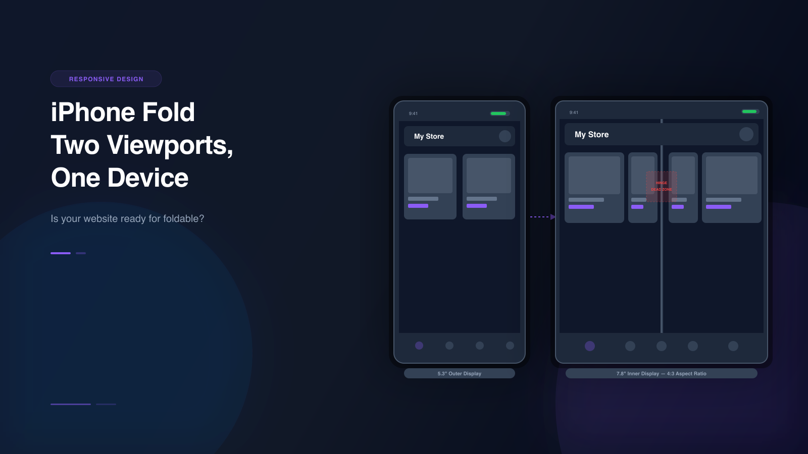
When it arrives, it will be the first Apple device with two completely different screen configurations in a single phone. The outer display is roughly 5.3 inches — similar to an iPhone SE. The inner display is roughly 7.8 inches — closer to an iPad mini in landscape. The aspect ratio shifts from a narrow phone shape to a near-square tablet shape. And there is a physical hinge running down the center of the inner screen that creates a dead zone your layout has never had to account for.
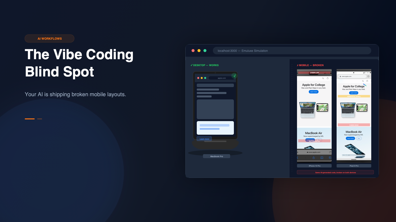
This is not a minor responsive edge case. It is a fundamental shift in how mobile layouts need to work.
What makes foldables different from every other device
Every responsive design challenge you have dealt with so far has assumed one thing: the screen is a single, unbroken rectangle.
You design for width. You add breakpoints. You test at 320px, 375px, 768px, and 1024px. The rectangle gets smaller or bigger, but it stays a rectangle.
Foldables break that assumption in three ways.
Two viewports in one device
A foldable phone has two distinct screen states. The folded state uses the outer display — a narrow, phone-shaped screen. The unfolded state uses the inner display — a wider, nearly square screen.
These are not just different sizes. They are different aspect ratios, different pixel densities, and different user expectations. A layout that works on a 5.3-inch narrow screen will not automatically work on a 7.8-inch near-square screen. The grid columns collapse. The image cropping changes. The navigation patterns shift.
Here are the approximate dimensions you are working with for the iPhone Fold:
| State | Display | Aspect Ratio | Estimated Viewport |
|---|---|---|---|
| Folded | 5.3" outer | ~19.5:9 (tall narrow) | ~375 x 812 |
| Unfolded | 7.8" inner | ~4:3 (near square) | ~600 x 800 |
Compare that to the devices you are already testing on. An iPhone 15 is 393 x 852. A Galaxy S25 is 360 x 780. Both are tall, narrow rectangles. The iPhone Fold unfolded is wider than it is tall relative to those phones. Your entire layout strategy changes.
The hinge is a dead zone
When the iPhone Fold is unfolded, there is a physical hinge mechanism running vertically through the center of the inner display. Apple's hinge uses liquidmetal — an amorphous alloy 2.5x stronger than titanium — designed to resist bending, deformation, and pressure while reducing or eliminating the display crease that has plagued competing foldables.
Despite the advanced materials, content that renders directly over the hinge area will be visually bisected — text gets cut in half, images lose their focal point, and interactive elements become unreliable.
This is not a software problem you can fix with CSS alone. It is a physical constraint of the hardware. Your layout needs to treat the hinge as a non-interactive zone, similar to how you would treat a safe area around a notch or home indicator.
The difference is that the hinge position is predictable — it is always in the center of the inner display when unfolded — but most developers have never had to design around a vertical dead zone in the middle of a screen before.
Users switch states mid-session
A user can start reading your page on the outer display, then unfold the phone to get a larger view. Or they can start on the inner display, then fold it to put the phone in their pocket. Either way, the viewport changes while the page is still loaded.
Your layout needs to handle this transition gracefully. If you have a fixed header that works on the outer display, it might cover half the viewport when the user unfolds. If you have a three-column grid on the inner display, it might collapse to one column when the user folds. The transition itself — the moment the screen changes — is where most layout failures happen.
The specific layout failures you will hit
These are the most common problems developers encounter when building for foldable devices. Each one is avoidable, but only if you test for it.
Grid collapse
A three-column product grid on the inner display becomes a single-column scroll on the outer display. This is not just a CSS issue — it changes the information density, the scroll depth, and the user's ability to compare options.
/* This works on the inner display */
.product-grid {
  display: grid;
  grid-template-columns: repeat(3, 1fr);
  gap: 1rem;
}

/* On the outer display, you need fewer columns */
@media (max-width: 400px) {
  .product-grid {
    grid-template-columns: repeat(2, 1fr);
  }
}
The problem is that max-width: 400px catches both the outer display of a foldable AND a regular iPhone SE. You need to be more specific about which device you are targeting, and that is where device-posture and viewport segment APIs become important.
Hinge obstruction
Content that renders directly under the hinge is visually split. This is most noticeable with:
- centered text that gets cut between two words
- product images where the subject falls on the hinge line
- video players with controls spanning the hinge
- maps or data visualizations that lose context when bisected
The fix is to detect the hinge position and add padding or margin to push content away from the center line. The CSS env() function provides viewport segment variables that give you the dimensions of each half of the display:
.fold-aware-layout {
  /* Left segment width (everything left of the hinge) */
  padding-left: env(viewport-segment-width 0 0);

  /* Right segment width (everything right of the hinge) */
  padding-right: env(viewport-segment-width 1 0);
}
This lets you build layouts that respect the physical hardware instead of fighting it.
Fixed header explosion
A sticky header that is 56px tall on the outer display is fine. The same 56px header on the inner display — which is nearly square — takes up a much larger percentage of the viewport. On a 800px-tall inner display, a 56px header is 7% of the screen. On a 400px-tall outer display, it is 14%. The proportions shift, and what felt balanced on one screen feels cramped on the other.
/* Adaptive header height based on viewport */
.site-header {
  height: clamp(48px, 8vh, 72px);
}

/* Or use viewport segments for foldable-specific sizing */
@media (device-posture: continuous) {
  .site-header {
    height: 56px;
  }
}

@media (device-posture: folded) {
  .site-header {
    height: 44px;
  }
}
Aspect ratio lock
Properties like aspect-ratio that you set for phone-shaped content break on the near-square inner display. A video player set to aspect-ratio: 16/9 works on the outer display but may overflow or leave excessive whitespace on the inner display.
/* This works on the outer display */
.video-player {
  aspect-ratio: 16 / 9;
  width: 100%;
}

/* On the inner display, consider a wider aspect ratio or flexible sizing */
@media (min-width: 600px) and (device-posture: continuous) {
  .video-player {
    aspect-ratio: 4 / 3;
    max-width: 80%;
    margin: 0 auto;
  }
}
Keyboard overlap
The virtual keyboard behaves differently on the outer and inner displays. On the smaller outer display, the keyboard takes up a much larger percentage of the viewport. Input fields that are visible on the inner display may scroll off-screen or get covered by the keyboard on the outer display.
This is especially critical for:
- login forms
- checkout address fields
- search inputs
- chat interfaces
- any form with multiple fields
The CSS env(keyboard-inset-height) variable can help you detect and respond to the keyboard, but only if your layout is designed to be keyboard-aware in the first place.
The CSS you need to write
Foldable device support relies on three CSS technologies that are already available in modern browsers.
Device posture media query
The device-posture media feature detects whether a foldable device is folded or unfolded:
/* Applied when the device is folded (outer display active) */
@media (device-posture: folded) {
  .layout {
    grid-template-columns: 1fr;
  }
}

/* Applied when the device is unfolded (inner display active) */
@media (device-posture: continuous) {
  .layout {
    grid-template-columns: 1fr 2fr 1fr;
  }
}
The continuous value means the screen is flat — fully unfolded. The folded value means the device is closed or partially closed. There is also a half-open value for devices that support intermediate positions.
Browser support is growing. Chrome and Edge support device-posture today. Safari support is expected with the iPhone Fold launch. For devices that do not support it, you need fallback media queries.
Viewport segment environment variables
The env(viewport-segment-*) variables give you the dimensions and positions of each segment of a multi-segment display. On a foldable phone unfolded, there are two segments — one on each side of the hinge.
.fold-aware-grid {
  display: grid;
  grid-template-columns: env(viewport-segment-width 0 0) env(viewport-segment-width 1 0);
  gap: 16px;
}
The first argument is the segment index (horizontal), the second is the segment index (vertical). For a typical foldable in landscape orientation, 0 0 is the left segment and 1 0 is the right segment.
You can also use these variables to size content to fit exactly within one segment:
.left-panel {
  width: env(viewport-segment-width 0 0);
  height: env(viewport-segment-height 0 0);
  overflow: auto;
}

.right-panel {
  width: env(viewport-segment-width 1 0);
  height: env(viewport-segment-height 1 0);
  overflow: auto;
}
This is how you build layouts that snap cleanly to each half of the display without content crossing the hinge.
JavaScript viewport segment detection
For dynamic behavior that CSS cannot handle alone, the Viewport Segments API provides JavaScript detection:
// Check if the device has multiple viewport segments
if ('viewportSegments' in window) {
  const segments = window.viewportSegments;

  segments.forEach((segment) => {
    console.log(`Segment ${segment.index}: ${segment.width}x${segment.height}`);
  });
}

// Listen for segment changes (fold/unfold)
window.addEventListener('resize', () => {
  if ('viewportSegments' in window) {
    const segmentCount = window.viewportSegments.length;

    if (segmentCount > 1) {
      // Device is unfolded — show multi-panel layout
      document.body.classList.add('unfolded');
    } else {
      // Device is folded — show single-panel layout
      document.body.classList.remove('unfolded');
    }
  }
});
This lets you dynamically swap between folded and unfolded layouts without relying solely on CSS media queries.
Progressive enhancement pattern
Because device-posture and viewport segments are not universally supported yet, use a progressive enhancement approach:
/* Base layout — works everywhere */
.content-grid {
  display: grid;
  grid-template-columns: 1fr;
  gap: 1rem;
}

/* Enhancement for wider screens (tablets, desktops) */
@media (min-width: 768px) {
  .content-grid {
    grid-template-columns: repeat(2, 1fr);
  }
}

/* Enhancement for foldable devices (unfolded) */
@supports (device-posture: continuous) {
  @media (device-posture: continuous) {
    .content-grid {
      grid-template-columns: env(viewport-segment-width 0 0) env(viewport-segment-width 1 0);
      gap: 0;
    }

    .content-grid > *:first-child {
      border-right: 1px solid #e5e7eb;
      padding-right: 1rem;
    }

    .content-grid > *:last-child {
      padding-left: 1rem;
    }
  }
}
This pattern gives you a solid fallback for devices that do not support foldable CSS features, while providing an optimized experience for devices that do.
Building apps for fold and flip devices
Foldable support is not just about CSS. If you are building a web application — not just a marketing site — there are additional considerations.
State persistence across fold transitions
When a user unfolds or folds their device, the page does not reload. The viewport changes, but the application state persists. This means:
- scroll position should be preserved or intelligently reset
- form data should not be lost
- modal dialogs should resize or reposition
- media playback should continue without interruption
- navigation state (open menus, expanded accordions) should adapt to the new viewport
// Detect fold state changes and adapt
const mediaQuery = window.matchMedia('(device-posture: continuous)');

function handleFoldChange(event) {
  if (event.matches) {
    // Device unfolded — expand sidebar, show multi-panel layout
    document.querySelector('.sidebar').classList.add('expanded');
    document.querySelector('.main-content').classList.remove('full-width');
  } else {
    // Device folded — collapse sidebar, go full-width
    document.querySelector('.sidebar').classList.remove('expanded');
    document.querySelector('.main-content').classList.add('full-width');
  }
}

mediaQuery.addEventListener('change', handleFoldChange);
Flex mode and half-open states
Samsung's foldables and Google's Pixel Fold support "flex mode" — where the device is partially folded at an angle, like a laptop. The top half of the screen shows content, and the bottom half shows controls.
If your app supports this use case, you need to detect the half-open posture and split your layout accordingly:
@media (device-posture: folded) {
  /* Half-open / flex mode layout */
  .app-layout {
    display: grid;
    grid-template-rows: 1fr auto;
  }

  .app-layout .content {
    /* Top half — visible content */
    height: 50vh;
    overflow: auto;
  }

  .app-layout .controls {
    /* Bottom half — controls, keyboard, or buttons */
    height: 50vh;
    padding: 1rem;
  }
}
Touch and interaction differences
Foldable devices have different touch characteristics depending on the state:
- Folded: Standard phone touch targets, single-column interaction
- Unfolded: Larger touch targets needed, possible stylus input (S Pen on Galaxy Z Fold), split-screen multitasking
- Half-open: Top half may be viewed at an angle — content should be readable without direct touch, bottom half is the primary touch surface
/* Larger touch targets on inner display */
@media (device-posture: continuous) {
  button, a, input {
    min-height: 48px;
    min-width: 48px;
  }

  /* Stylus-friendly hit areas */
  .drawing-canvas {
    touch-action: none;
    cursor: crosshair;
  }
}
PWA display modes for foldables
Progressive Web Apps need to declare display modes that work across both screen states:
{
  "display": "standalone",
  "display_override": ["window-controls-overlay"],
  "background_color": "#ffffff",
  "theme_color": "#000000"
}
The standalone display mode ensures your PWA uses the full viewport on both the outer and inner displays. The window-controls-overlay override allows your app to draw into the title bar area on devices that support it, giving you more screen real estate on the inner display.
How to test foldable layouts today
You do not need to wait for the iPhone Fold to start testing. Foldable Android devices are already shipping, and simulation tools can help you validate layouts before hardware is in your hands.
The devices already in market
| Device | Outer Display | Inner Display | Fold Axis |
|---|---|---|---|
| Samsung Galaxy Z Fold 6 | 323 x 792 | 619 x 720 | Vertical |
| Samsung Galaxy Z Flip7 | 240 x 250 | 360 x 800 | Horizontal |
| Google Pixel 9 Pro Fold | 412 x 924 | 791 x 820 | Vertical |
| Google Pixel 10 Pro Fold | 412 x 900 | 791 x 820 | Vertical |
| Google Pixel Fold | 384 x 832 | 840 x 700 | Vertical |
Each of these devices has different viewport dimensions, pixel densities, and fold behaviors. Testing on all of them — or simulating them — is the only way to catch layout issues before users do.
What Chrome DevTools can and cannot do
Chrome DevTools has basic foldable support. You can toggle between single and dual-screen modes, and set device posture to continuous or folded. But there are limitations:
- the device list does not include the iPhone Fold
- hinge rendering is not simulated
- crease effects are not visible
- viewport segment environment variables may not behave identically to real hardware
- there is no way to test iOS Safari behavior on a Windows or Linux machine
For quick responsive checks, DevTools is fine. For validating that your foldable layout actually works, you need higher-fidelity simulation.
How Emuluxe solves foldable testing
Emuluxe includes five foldable device profiles with full fold-state simulation. Each profile contains:
- Folded viewport and screen dimensions — the exact pixel dimensions of the outer display
- Unfolded viewport and screen dimensions — the exact pixel dimensions of the inner display
- Fold behavior — the axis (vertical or horizontal) and direction of the fold
- Hinge rendering — a visible hinge element with configurable width and color, positioned correctly for each device
- Crease overlay — a CSS gradient effect that simulates the visual crease on the inner display
- Fold-state toggle — switch between folded and unfolded states with a single click or keyboard shortcut
- Animated transitions — 850ms fold/unfold animation with 3D perspective transforms
- Safe area definitions — separate safe area insets for folded and unfolded states

Here is the workflow for testing a foldable layout in Emuluxe:
- Start your dev server (Vite, Webpack, or any local server).
- Open Emuluxe in VS Code or Cursor using
Cmd+Alt+E. - Select a foldable device from the Foundry — for example, Samsung Galaxy Z Fold 6 or Google Pixel 10 Pro Fold.
- The simulator opens in the folded state by default, showing the outer display.
- Click the fold toggle button (or press the keyboard shortcut) to switch to the unfolded state.
- The viewport swaps to the inner display dimensions. The hinge appears. The crease overlay activates.
- Check your layout on both states. Look for grid collapse, hinge obstruction, header explosion, and aspect ratio issues.
- Capture a screenshot of each state and attach it to your pull request as proof.

In practice, this is what it looks like. The screenshot below shows Emuluxe simulating a Google Pixel 10 Pro Fold displaying the GSMArena page for the upcoming Apple iPhone Ultra — the same kind of real-world content your users will be viewing on foldable devices:
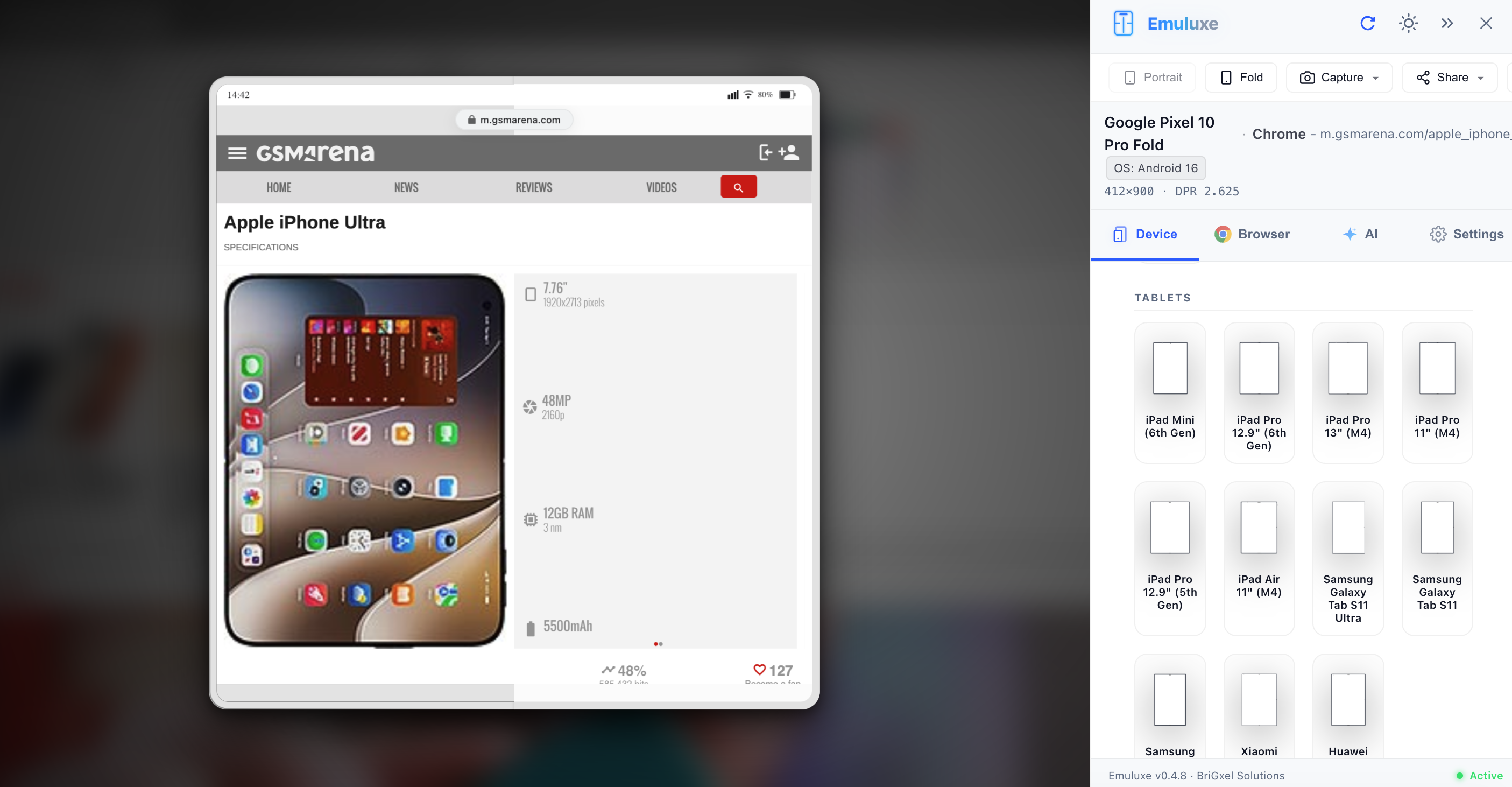
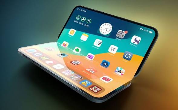
This is what the iPhone Fold form factor looks like in practice — a device that transitions between a narrow phone and a near-square tablet, with the hinge running through the center of the inner display:
For automated testing, Emuluxe's MCP server lets AI agents access foldable device context. Your coding assistant can simulate a foldable device, receive the rendered viewport data, and suggest layout fixes based on the actual device dimensions — not guesses.
The CLI also supports foldable testing. Run emuluxe snapshot --device samsung-z-fold6 --fold-state unfolded to capture a screenshot of the inner display as part of your CI/CD pipeline. This catches foldable regressions automatically on every push.
What to check before iPhone Fold ships
Use this checklist for any page that matters to your business:
Outer display (folded)
- Does the navigation work on a narrow, phone-shaped screen?
- Are touch targets at least 44px?
- Does the form layout stack correctly?
- Is the CTA visible without scrolling?
- Does the keyboard not cover critical input fields?
Inner display (unfolded)
- Does the grid layout adapt to the near-square aspect ratio?
- Is any content hidden under the hinge crease?
- Does the header resize for the larger viewport?
- Are images cropped appropriately for the wider display?
- Does the layout feel intentional, not just "zoomed in"?
Fold transition
- Does the layout adapt when the user folds or unfolds mid-session?
- Is scroll position preserved or intelligently reset?
- Do fixed elements (headers, footers, CTAs) resize correctly?
- Does media playback continue without interruption?
- Is form data preserved across the transition?
Hinge awareness
- Is any text bisected by the hinge?
- Do images avoid the center line, or is the subject split?
- Are interactive elements positioned away from the hinge?
- Does the layout treat the hinge as a natural divider?
Why this matters now
The iPhone Fold is not a distant rumor. Ming-Chi Kuo's supply chain analysis confirms Samsung Display has received orders for 7-8 million foldable panels, with Foxconn beginning assembly in Q3/Q4 2025 and mass production in H2 2026. Samsung has already shipped five generations of Galaxy Z Fold. Google has shipped two generations of Pixel Fold. Foldable devices are not a future trend — they are a present reality with a growing install base.
Every month you wait to test foldable layouts is a month of technical debt accumulating. When the iPhone Fold ships, your users will immediately start opening your site on a device with two viewports. The sites that handle it well will feel modern and polished. The sites that do not will feel broken.
The developers who start testing now — on the foldable devices already in market and through simulation tools like Emuluxe — will be ready when the form factor goes mainstream. The developers who wait will be scrambling to fix layouts after users have already noticed.
The fix is not to rebuild your entire CSS architecture. It is to add foldable awareness to your existing responsive workflow. Test on a foldable profile. Check the hinge. Toggle between folded and unfolded. Fix what breaks. Repeat.
Your responsive design was built for rectangles. Foldables are not rectangles. Start testing now.
