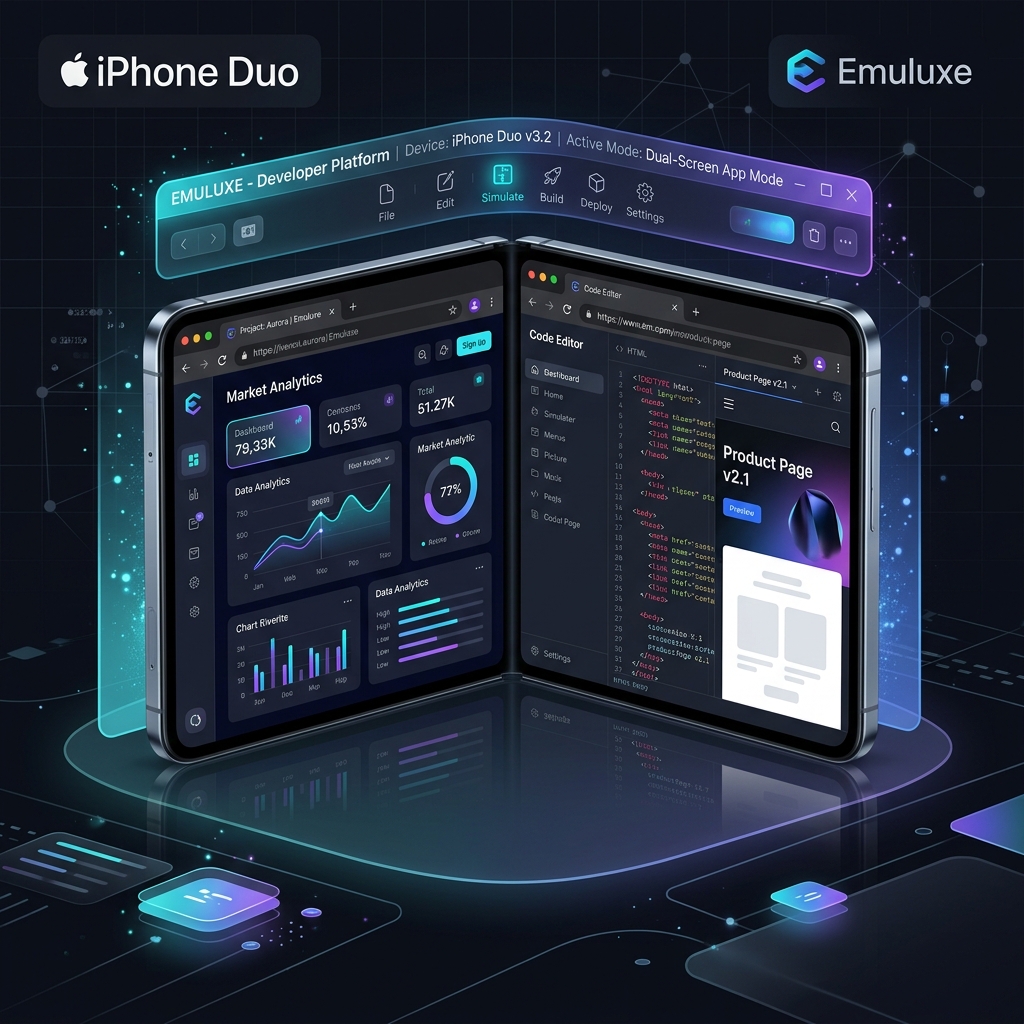
Apple's launch of the iPhone Duo in September 2026 marks the biggest transformation in mobile hardware since the original iPhone. Apple's flagship foldable device features a 5.4-inch outer display and a 7.6-inch inner Super Retina XDR display crafted from Grade 5 titanium, powered by the A20 Pro chip running iOS 27.1.
Unlike traditional single-screen smartphones or inner-crease foldables, the iPhone Duo operates as both a compact pocket phone when folded and a 3:2 dual-viewport digital workstation when opened flat.
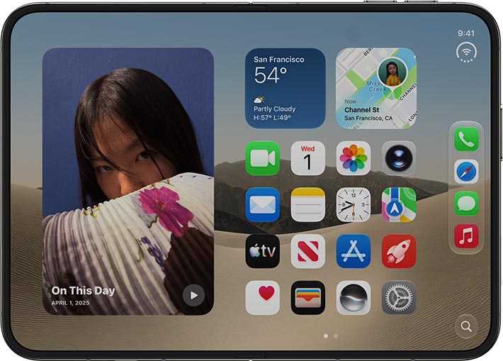
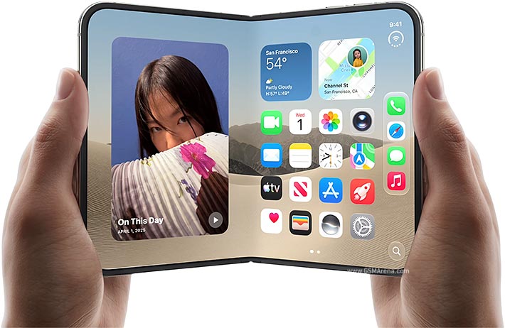
For web developers, UI engineers, and application architects, the iPhone Duo brings a fundamental shift: your web application will no longer run inside a single, unbroken rectangular viewport. Users are actively viewing web applications spanned across twin displays, or paired side-by-side with a second web application mid-session.
To bridge this gap, we are excited to introduce Emuluxe App Mode—a dedicated, developer-centric simulation environment designed specifically for dual-screen devices, progressive web apps (PWAs), and desktop-class web applications.
Editor's note (2026-10-01). This post uses "App Mode" for a web feature: the standalone-PWA presentation that the manifest in §5 triggers, so your app opens in a native-looking window with posture controls. That is not the same feature as the App Mode we now ship for native apps — driving a real iOS or Android app inside a device frame from a simulator, emulator, or connected phone on your own machine, with
app_*MCP tools and aemx appCLI surface. This article predates that contract, so the two names collided. The behavior described below is unchanged; for the native feature, see App Mode and the App Mode Setup Guide.
1. What makes the iPhone Duo different from standard mobile devices
Every responsive design framework built over the past decade assumes one fundamental constraint: the display is a single, continuous screen rectangle. You write CSS media queries for max-width: 375px, 768px, or 1024px, assuming that the viewport only expands or contracts smoothly.
The iPhone Duo challenges this assumption in three distinct ways:
Twin Viewports with Physical Seam
The iPhone Duo houses a 5.4-inch outer display and a 7.6-inch inner Super Retina XDR OLED display. When unfolded, the total canvas measures a near-square aspect ratio (~3:2), separated down the middle by a physical 12-pixel micro-hinge seam.
Content placed directly across the central axis will be physically split. Unoptimized headers get bisected mid-word, CTA buttons drop into the seam dead zone, and product cards become unreadable.
| Posture State | Display Panel | Aspect Ratio | Per-Panel Viewport | Total Combined Viewport |
|---|---|---|---|---|
| Folded (Single) | 5.4" Outer Display | 19.5:9 (Narrow Phone) | 390 x 844 pt | 390 x 844 pt |
| Unfolded Spanned | 7.6" Inner Display | ~3:2 (Near Square) | 420 x 840 pt (x2) | 852 x 840 pt (incl. seam) |
| Flex / Laptop Posture | Dual Display Angle | 16:9 / 16:9 Split | 420 x 420 pt (x2) | 420 x 840 pt |
Side-by-Side App Pairing
On iOS for iPhone Duo, users can run two distinct web applications side-by-side simultaneously. Your web app might occupy the left screen segment while a checkout or messaging app occupies the right segment.
This means your web layout must respond not just to browser resizing, but to active app pairing events where your available screen width dynamically shrinks to half-viewport without triggering full mobile drawer collapse.
Dynamic Posture Swapping Mid-Session
A user browsing your e-commerce store on the outer display can flip open the iPhone Duo mid-session. The browser instantly transitions from single-viewport to dual-viewport spanned posture without reloading the page. JavaScript state, scroll position, and active form inputs must remain intact across the posture switch.
2. Common layout failures on dual-screen hardware
When running standard web apps on dual-screen devices like the iPhone Duo, developers encounter several critical UI failures:
- The Seam Cutoff: Centered text, hero headlines, or product images positioned in the horizontal center get sliced by the 12px hardware seam.
- Fixed Header Overlap: Sticky navigation headers designed for tall 19.5:9 displays take up an excessive portion of the screen height when spanned in near-square 3:2 mode.
- Modal Dialog Bisection: Centered popups or cookie consent banners render right over the hinge seam, rendering close buttons unclickable.
- Keyboard Inset Explosion: When the virtual keyboard triggers on one screen segment, unoptimized viewports shift both panels awkwardly, obscuring input fields.
3. Writing Seam-Aware CSS with Viewport Segments
To build dual-screen web apps for the iPhone Duo, modern browsers utilize the W3C CSS Viewport Segments API and @media (screen-spanning) queries.
CSS Viewport Segment Variables
Modern engines expose environment variables representing the bounds of each screen segment:
/* Target dual-screen vertical fold posture (e.g. iPhone Duo unfolded) */
@media (screen-spanning: single-fold-vertical) {
  .app-layout {
    display: grid;
    /* Divide layout into Left Segment, Seam Gap, and Right Segment */
    grid-template-columns:
      env(viewport-segment-width 0 0)
      env(viewport-segment-gap-width 0 0)
      env(viewport-segment-width 1 0);
    width: 100vw;
    height: 100vh;
  }

  .left-panel {
    grid-column: 1;
    padding: 24px;
  }

  /* Keep central seam clean from interactive controls */
  .seam-divider {
    grid-column: 2;
    background: transparent;
  }

  .right-panel {
    grid-column: 3;
    padding: 24px;
  }
}
JavaScript Posture Listener
For dynamic React/Next.js components, detect posture state and screen segments programmatically:
import { useEffect, useState } from 'react';

export function useDualScreenPosture() {
  const [isSpanned, setIsSpanned] = useState(false);
  const [segments, setSegments] = useState<DOMRect[]>([]);

  useEffect(() => {
    function updatePosture() {
      if ('getWindowSegments' in window) {
        // @ts-ignore - W3C Viewport Segments API
        const winSegments = window.getWindowSegments();
        setSegments(winSegments);
        setIsSpanned(winSegments.length > 1);
      }
    }

    updatePosture();
    window.addEventListener('resize', updatePosture);
    return () => window.removeEventListener('resize', updatePosture);
  }, []);

  return { isSpanned, segments };
}
4. Introducing Emuluxe App Mode
Testing dual-screen viewports, seam gaps, and posture transitions previously required expensive hardware or clunky native Android emulators.
With Emuluxe App Mode, we are bringing high-fidelity dual-screen simulation and standalone web app debugging directly into your development workflow.
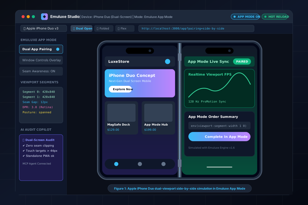
Unified Device Frame Architecture Across Platforms
Emuluxe’s Unified Frame Registry (frame-registry.ts) models the official Apple iPhone Duo hardware specifications with sub-pixel precision across all three architectures—the VS Code / Cursor Extension, Chrome Extension, and Web Studio Platform:
- Outer Display Frame: Renders the 5.4-inch display with the official top Dynamic Island inset (
{ width: 105, height: 34, offsetTop: 12 }), outer Grade 5 titanium chamfer, and top-edge volume key placement. - Inner Display Frame: Renders the 7.6-inch unfolded Super Retina XDR canvas with an under-display front camera profile (zero notch obstruction on inner viewports) and central liquidmetal hinge seam.
- Cross-Platform Parity: Whether you test on VS Code, Chrome Extension, or Web Studio, the exact safe area insets, Dynamic Island dimensions, and posture kinematics remain 100% identical.
Key Features of Emuluxe App Mode
- Dual Viewport App Pairing: Simulate two web applications running side-by-side on twin displays, with active DOM event synchronization and cross-window state tracking.
- Hardware Seam & Hinge Rendering: Real-time visual rendering of the iPhone Duo 12px liquidmetal seam with configurable transparency, gap width, and posture angles.
- Standalone PWA Environment: Test web applications under
display: "standalone"anddisplay_override: ["window-controls-overlay"]without browser URL chrome interference. - Instant Posture Swapping: One-click toggling between Folded (Single), Unfolded (Spanned), and Flex (Laptop) postures with 120Hz smooth CSS animations.
- AI-Powered Seam Diagnostics: Emuluxe AI Audit Copilot automatically flags elements, buttons, or text nodes overlapping the central seam line.

5. Configuring Web App Manifest for App Mode
To ensure your web app seamlessly enters Emuluxe App Mode and takes full advantage of the iPhone Duo's dual displays, configure your manifest.json:
{
  "name": "LuxeStore Enterprise",
  "short_name": "LuxeStore",
  "start_url": "/",
  "display": "standalone",
  "display_override": [
    "window-controls-overlay",
    "minimal-ui"
  ],
  "theme_color": "#0f172a",
  "background_color": "#020617",
  "icons": [
    {
      "src": "/icon-512.png",
      "sizes": "512x512",
      "type": "image/png"
    }
  ]
}
When Emuluxe detects a compatible Web App Manifest, App Mode activates automatically in the simulator, presenting your app in a native window frame with active posture controls.
6. Integrating Emuluxe App Mode into your workflow
Emuluxe supports dual-screen iPhone Duo simulation across your entire tech stack:
- VS Code & Cursor Extension: Press
Cmd+Alt+Eto launch the Emuluxe simulator alongside your code editor with real-time localhost hot reloading. - Chrome Extension: Test live production sites or local dev servers with single-click iPhone Duo dual-viewport overlays.
- Emuluxe MCP Server for AI Agents: Connect Cursor, Claude Code, or Devin to the
@emuluxe/mcp-server. AI agents can programmatically capture dual-screen snapshots, detect seam collisions, and output responsive CSS fixes automatically. - Emuluxe CLI: Automate dual-viewport snapshot testing in GitHub Actions CI/CD pipelines.
7. Dual-Screen Developer Checklist
Before shipping your web application for the iPhone Duo launch, verify these key criteria:
- Seam Safety Zone: Are all primary titles, CTAs, and media elements clear of the central 12px seam?
- Dual-Screen Grid Layout: Does the layout utilize
@media (screen-spanning: single-fold-vertical)to split content cleanly across panels? - Posture State Transitions: Does the page preserve scroll position and form inputs when swapping between folded and unfolded states?
- App Mode Window Controls: Is custom titlebar branding rendered properly when
window-controls-overlayis enabled? - Touch Target Sizing: Are interactive elements at least 44x44pt on both screen segments?
- Keyboard Awareness: Does input focus on Segment 0 refrain from disrupting layout bounds on Segment 1?
Conclusion & Next Steps
The iPhone Duo represents the future of mobile computing—combining pocket mobility with dual-screen desktop productivity. By implementing seam-aware CSS layout patterns and leveraging Emuluxe App Mode, you can ensure your web applications deliver an exceptional user experience on next-generation dual-display hardware.
Start testing your app on the iPhone Duo today: