Checkout is where mobile quality stops being abstract.
If a product grid is slightly awkward, users may still browse. If checkout is awkward, users leave.
That is why ecommerce teams are one of the strongest fits for high-fidelity mobile simulation.
Why checkout deserves its own workflow
Cart and checkout flows are unusually sensitive because they combine:
- layout precision
- form behavior
- browser UI collisions
- performance pressure
- payment complexity
That means small visual or interaction issues can have outsized business impact.
What should be checked
When simulating ecommerce checkout flows, the team should focus on:
- cart drawer behavior and safe-area compliance
- sticky checkout CTAs and home indicator overlap
- form field spacing and touch target sizing
- input focus and keyboard overlap issues
- payment button visibility under browser chrome
- error message handling in constrained viewports
- post-cart navigation and recovery flows
- landscape orientation behavior for tablet checkout
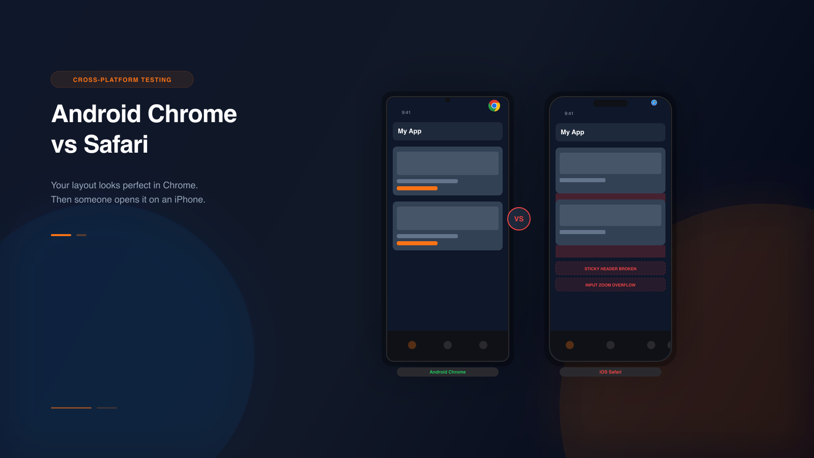
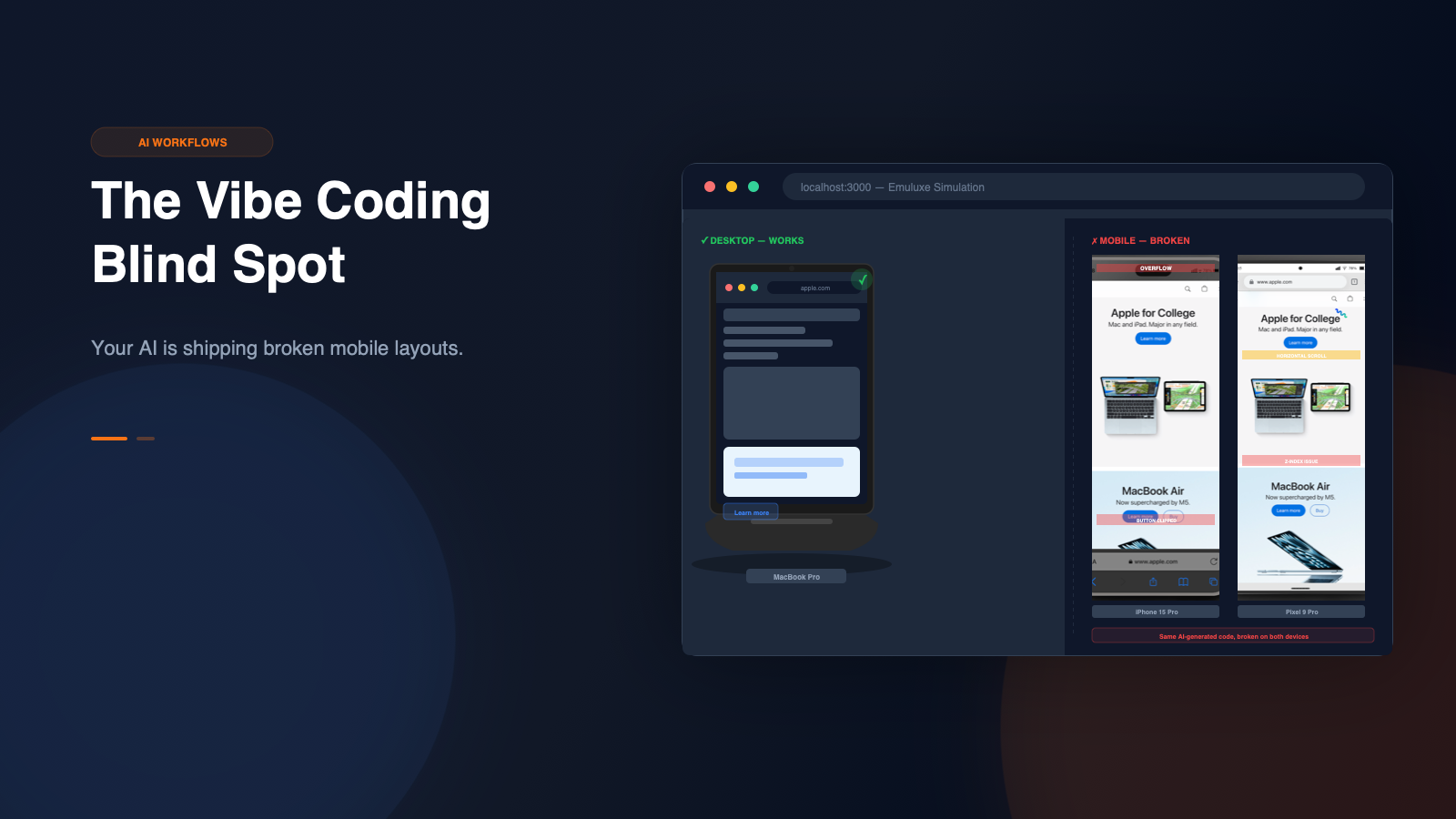
These are the kinds of details that often look acceptable in desktop review but become much more fragile in real mobile contexts. Emuluxe's high-fidelity simulation renders actual safe areas (notches, dynamic islands, home indicators) so you can verify that your "fixed" bottom checkout buttons don't get obscured by the software home bar on iPhone or the navigation bar on Android.
Why simulation beats guesswork
Ecommerce teams already know mobile matters. The problem is often the workflow used to validate it.
If the team depends on ad hoc phone checks or resized browser tabs, important issues may only be caught after: