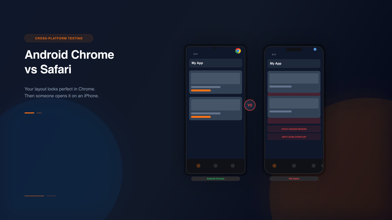
Safe areas are one of those details that look minor until they cause a visible mistake on a real device.
A CTA can sit too low. A header can crowd the notch. A floating bar can collide with browser chrome or the home indicator. The page still technically “works,” but it stops feeling trustworthy.
Why teams miss these issues
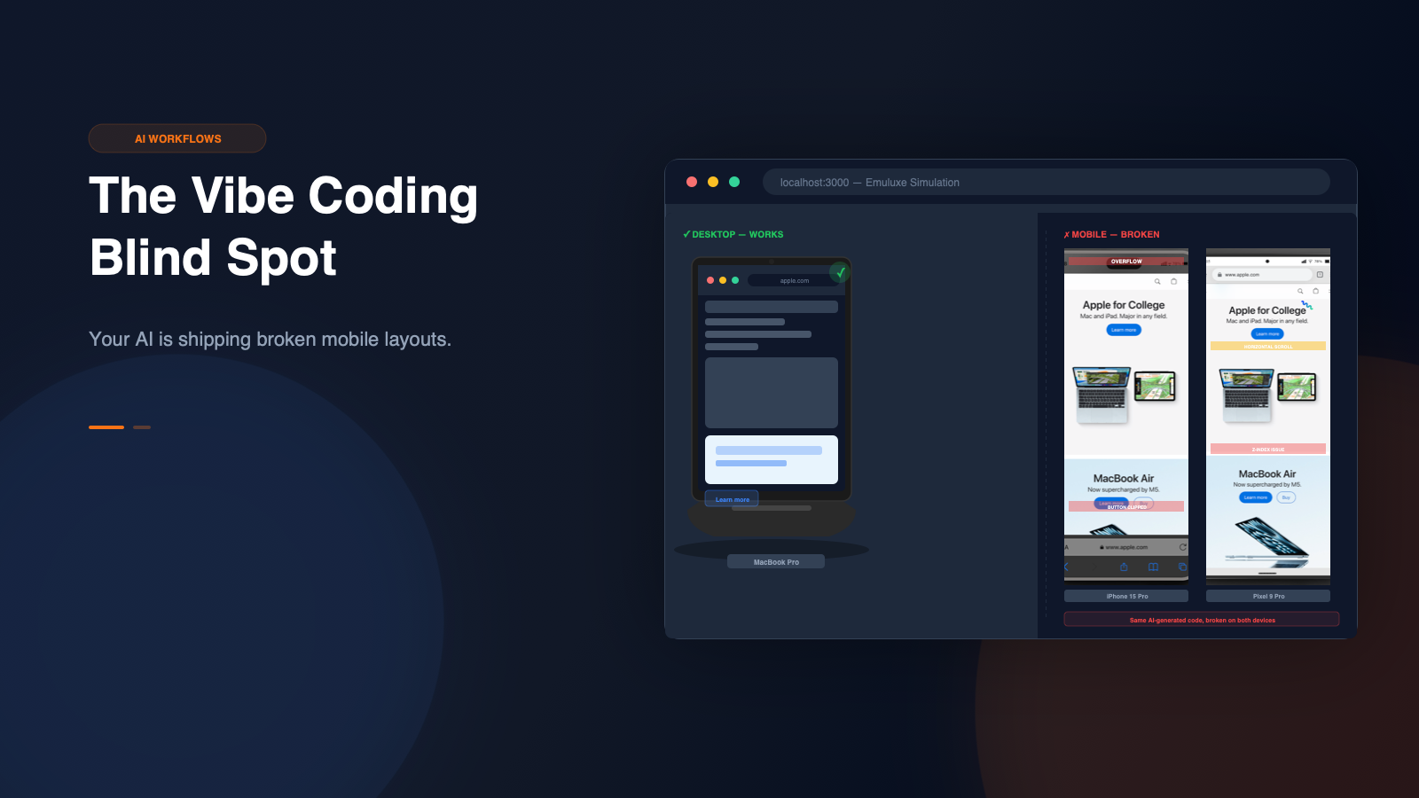
Safe-area problems are easy to miss because many teams do their first mobile check too late and with the wrong tools.
If the workflow is:
- resize the desktop browser
- skim the page
- move on
then subtle safe-area issues are likely to slip through.
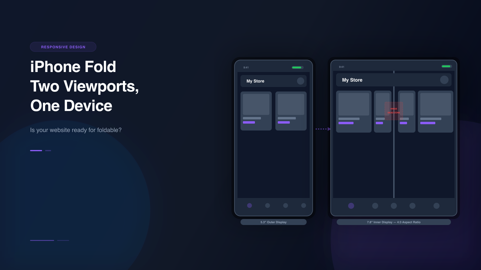
What should be tested
When you are testing notch and safe-area behavior, pay attention to:
- sticky headers
- fullscreen hero sections
- bottom navigation
- floating CTAs
- modals and drawers
- browser UI overlap on long pages
These are the components most likely to feel “almost right” while still being visually off on mobile.
Why desktop simulation helps
Testing safe areas on desktop is faster than relying on manual phone checks for every small change.
With high-fidelity simulation, you can:
- switch between device profiles quickly
- rotate orientation without changing tools
- compare different hardware shapes
- capture proof for fixes or approvals
That makes safe-area checks something teams can repeat instead of something they postpone.
Where to add it in the workflow
The best place to test safe areas is not only at the very end.
Teams should check them:
- during localhost iteration
- before staging handoff