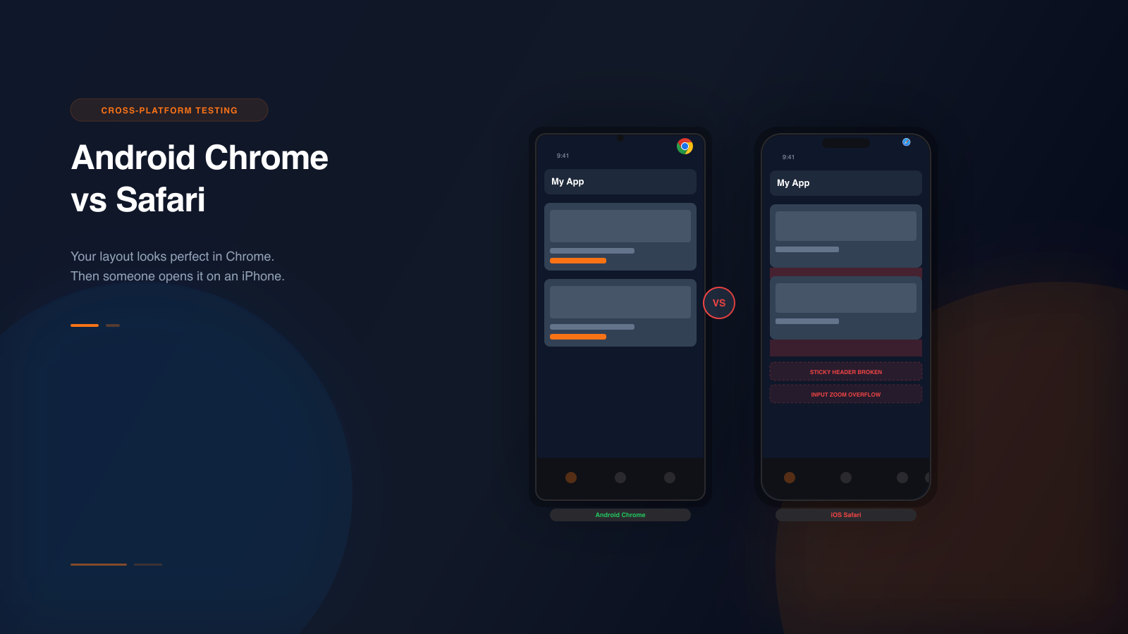
There is a reason teams still get surprised by mobile bugs after “checking” the page in a desktop browser.
What they often did was not mobile simulation. It was viewport resizing.
That is useful for quick responsive work, but it is not the same thing.
What viewport resizing does well
Viewport resizing is fast and familiar. It can help you:
- catch obvious responsive breakpoints
- confirm whether a layout stacks or wraps
- see rough content hierarchy on smaller screens
For early iteration, that is fine. It gives you a quick approximation.
Where viewport resizing breaks down
The problem starts when teams confuse approximation with validation.