There are two different problems in mobile web development, and they require two different kinds of tools.
One problem is: "I need to show what this page looks like on a phone for a presentation or demo."
The other problem is: "I need to build and validate this page so it actually works correctly on mobile devices."
Mobile FIRST solves the first problem. Emuluxe solves the second-and it solves it much better than any viewport resizer could.
Understanding this distinction is critical because using Mobile FIRST for development validation leads to missed bugs, false confidence, and production issues that could have been caught earlier.
What Mobile FIRST actually does
Mobile FIRST is a Chrome and Firefox extension that simulates phone and tablet viewports. It has 58 device models, from iPhone 5 to iPad Air, and it's designed to help you:
- Test responsive sites at different resolutions
- Take beautiful screenshots for presentations
- Create animated GIFs for demos
- Switch between devices quickly
- Capture transparent PNGs
It has a 4.9 rating with 54.8K reviews, which makes sense for what it does. If you need a quick way to show a client what their site looks like on an iPhone, or you need a clean screenshot for a marketing email, Mobile FIRST is excellent.
Learn more at webmobilefirst.com or view their pricing plans.
The key word in their own description is "simulate." They simulate viewports. They do not simulate devices.
What Emuluxe actually does
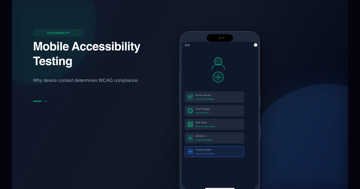
Emuluxe provides high-fidelity mobile simulation. It doesn't just resize a viewport-it creates a simulated mobile environment that includes:
- Device-specific browser behavior: Chrome on a Pixel 6 behaves differently than Chrome on a Galaxy S22
- Hardware-aware rendering: Notches, dynamic islands, safe areas, and home indicators are rendered accurately
- Touch interaction patterns: Gestures, scrolling, and interactions behave like real mobile devices
- Browser UI simulation: Address bars, toolbars, and system chrome are part of the simulation
- Device context: Screen density, pixel ratio, and hardware-specific rendering characteristics
Emuluxe is designed for development and validation workflows in VS Code, Cursor, and Chrome. It's built to help you catch mobile bugs before they reach production, not to create pretty screenshots for presentations.
The viewport vs. simulation distinction
The difference between viewport resizing and high-fidelity simulation is the difference between a rectangle and a device.
Mobile FIRST gives you a rectangle that is 393px wide (like an iPhone 15). It shows you how your layout fits in that rectangle.
Emuluxe gives you an iPhone 15. It shows you how your layout fits in that rectangle, but it also shows you:
- How the dynamic island affects your header
- How the home indicator affects your bottom navigation
- How safe areas change your content margins
- How the browser's address bar interacts with your sticky elements
- How touch gestures actually feel on that specific device
This distinction is invisible until it matters. Then it becomes the difference between "this looks fine" and "this is broken in production."
Where Mobile FIRST excels
Mobile FIRST is the right tool when:
- You need presentation assets: Screenshots for emails, mockups for decks, GIFs for demos
- You're doing client demos: Showing a client what their responsive site looks like
- You need quick viewport checks: Verifying that a layout stacks correctly at different widths
- You're creating marketing materials: Clean device frames for promotional content
- You want device variety: Quickly switching between 58 different device models
For these use cases, Mobile FIRST is optimized and effective. It's not trying to be a development tool-it's trying to be a presentation tool, and it succeeds at that.
Where Emuluxe excels
Emuluxe is the right tool when:
- You're developing mobile features: Building components that need to work correctly on actual devices
- You're validating launch-critical pages: Checkout flows, landing pages, auth screens
- You need safe-area validation: Ensuring your layout respects notches, dynamic islands, and home indicators
- You're debugging mobile issues: Figuring out why something works on desktop but fails on mobile
- You need hardware-specific rendering: Real-time rendering of notches, dynamic islands, and safe-area insets
- You want system-level simulation: Light/dark mode, status bars, battery levels, touch pointer
- You care about production quality: You want to catch bugs before users do, not after
For these use cases, viewport resizing is not just insufficient-it's dangerous. Mobile FIRST cannot catch the issues that actually matter in production. You need device context, not just device dimensions.
Note: For advanced features like Parallel Simulation, Full AI Audits, and CI/CD integration, use the Emuluxe Platform. The Chrome Extension provides instant, lightweight simulation for quick checks.
The practical difference in a real workflow
Consider a common scenario: you're building a sticky header for a mobile app.
With Mobile FIRST
You resize to iPhone 15 dimensions (393px). The header looks fine. It's sticky. It doesn't overflow. You move on.
With Emuluxe
You simulate an iPhone 15. You notice that:
- The header overlaps with the dynamic island
- The safe area inset pushes your content down too far
- The browser's address bar covers your navigation when you scroll
- Touch gestures don't feel right because the header doesn't account for system chrome
You fix these issues before they reach production.
The difference isn't that Mobile FIRST is wrong-it's that Mobile FIRST isn't designed to catch these issues. It's designed to show you a viewport, not to simulate a device.
Why this matters for different roles
For designers and marketers
Mobile FIRST is often the better choice. You care about visual presentation, clean screenshots, and quick device switching. You're not debugging layout bugs or validating safe areas.
For developers and QA
Emuluxe is the better choice. You care about whether the code actually works on mobile devices. You need to catch safe-area issues, browser UI collisions, and touch interaction problems before they reach users.
For agencies
You likely need both. Use Mobile FIRST for client presentations and marketing materials. Use Emuluxe for development, QA, and validation before handoff.
The technical distinction
The technical difference is in what each tool simulates:
Mobile FIRST simulates:
- Viewport dimensions
- Device frames
- Orientation
- Basic responsive behavior
Emuluxe simulates:
- Viewport dimensions
- Device frames
- Orientation
- Safe areas and insets
- Notches and dynamic islands
- Browser UI (address bars, toolbars)
- Touch interaction patterns
- Device-specific browser behavior
- Screen density and pixel ratio
- Hardware-aware rendering
The first set is sufficient for presentation. The second set is necessary for development.
When to use both tools
The smartest teams use both tools for different parts of the workflow:
- Development: Use Emuluxe in VS Code or Cursor to build and validate mobile features
- Staging validation: Use Emuluxe in Chrome to verify production-like environments
- Client demos: Use Mobile FIRST to create clean screenshots and device frames
- Marketing materials: Use Mobile FIRST to generate presentation assets
Each tool has its place. The mistake is using Mobile FIRST for development validation, or using Emuluxe when you just need a quick screenshot.
The cost difference
Mobile FIRST offers in-app purchases and has a free tier. It's priced as a presentation tool.
Emuluxe is priced as a development tool. The investment reflects that it's designed for daily use in development workflows, not occasional use for presentations.
If you're using Mobile FIRST for development validation, you're likely missing bugs that would have been caught with high-fidelity simulation. The cost of those bugs in production-lost conversions, client complaints, emergency fixes-far exceeds the price difference between the tools.
The real question isn't which tool is cheaper. The question is: can you afford the cost of missing mobile bugs that Mobile FIRST cannot catch? For most development teams, the answer is no.
The future of each tool
Mobile FIRST will continue to excel at what it does: presentation, screenshots, and demos. The team is adding more devices, better capture features, and presentation-focused capabilities.
Emuluxe will continue to focus on high-fidelity simulation for development. That means deeper device context, better CI/CD integration, and more sophisticated AI-powered debugging.
These are different trajectories because they solve different problems. Neither tool is trying to be the other, and that's a good thing.
How to choose
The decision framework is simple:
Choose Mobile FIRST if:
- You need screenshots or GIFs for presentations
- You're doing client demos
- You want quick viewport checks
- You're creating marketing materials
- Presentation quality matters more than development accuracy
Choose Emuluxe if:
- You're developing mobile features
- You need to validate launch-critical pages
- You care about safe areas and notches
- You want to catch mobile bugs before production
- You need hardware-specific rendering (notches, dynamic islands, safe areas)
- You want system-level simulation (light/dark mode, status bars, touch pointer)
- You take mobile quality seriously
Note: For CI/CD integration, Parallel Simulation, and Full AI Audits, use the Emuluxe Platform. The Chrome Extension provides instant, lightweight simulation for quick checks.
Choose both if:
- You're an agency or product team that does both development and client work
- You need presentation assets AND development validation
- You have different team members with different needs
For most development teams, Emuluxe should be your default tool. Mobile FIRST is a nice-to-have addition for presentation work, but it should never be your primary tool for mobile validation.
The bottom line
Mobile FIRST is a viewport resizer optimized for screenshots and demos. Emuluxe is a high-fidelity simulator optimized for development and validation.
Both are excellent at what they do. The key is using the right tool for the right job.
If you're using Mobile FIRST for development validation, you're probably missing mobile bugs that would be caught with Emuluxe.
If you're using Emuluxe when you just need a quick screenshot for an email, you're probably overcomplicating a simple task.
Understand the distinction, use both tools appropriately, and you'll have both beautiful presentations and trustworthy mobile validation.
Get Started Today
Ready for high-fidelity mobile simulation?
Install Emuluxe Chrome Extension - Catch mobile bugs before they reach production with real device context, safe areas, and browser UI simulation.
Need presentation assets?
Install Mobile FIRST Extension - Create beautiful screenshots and device frames for demos and client presentations.